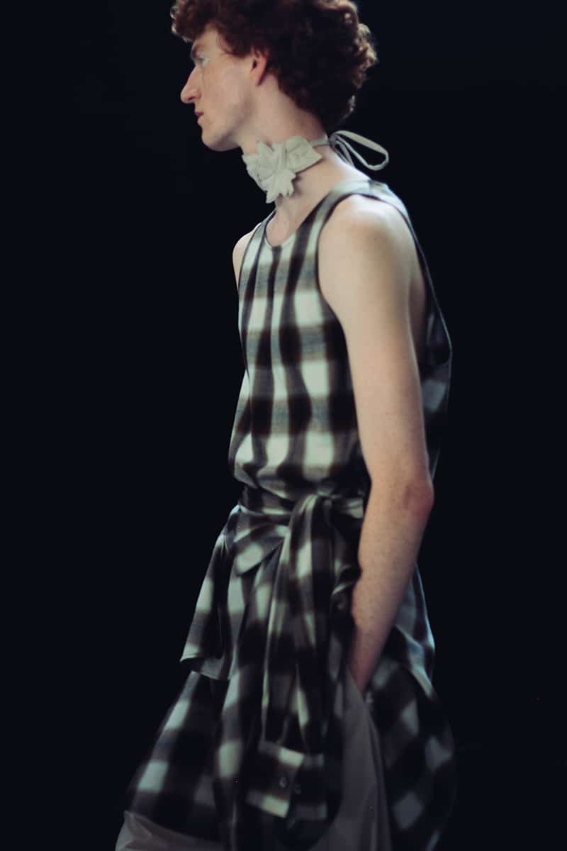
Jil Sander 2011 Fall Winter
by Luis Ferraz
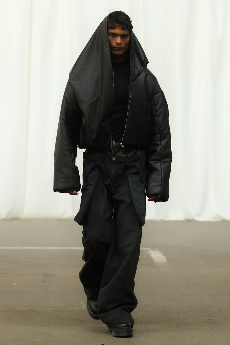
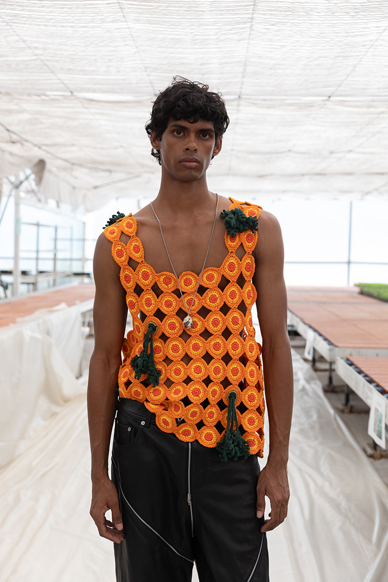
Costume National Homme 2011 Fall/Winter
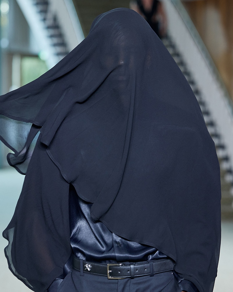
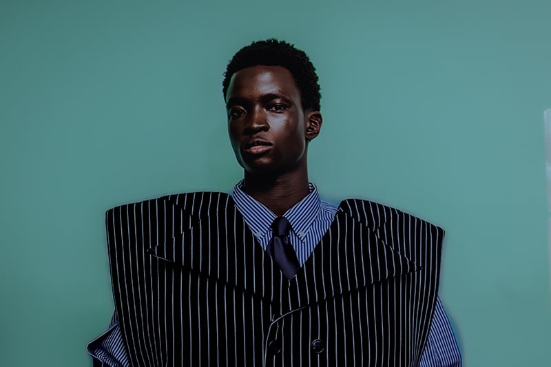
Vivienne Westwood 2011 Fall/Winter
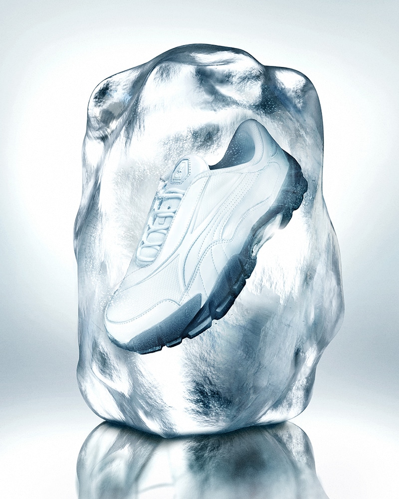
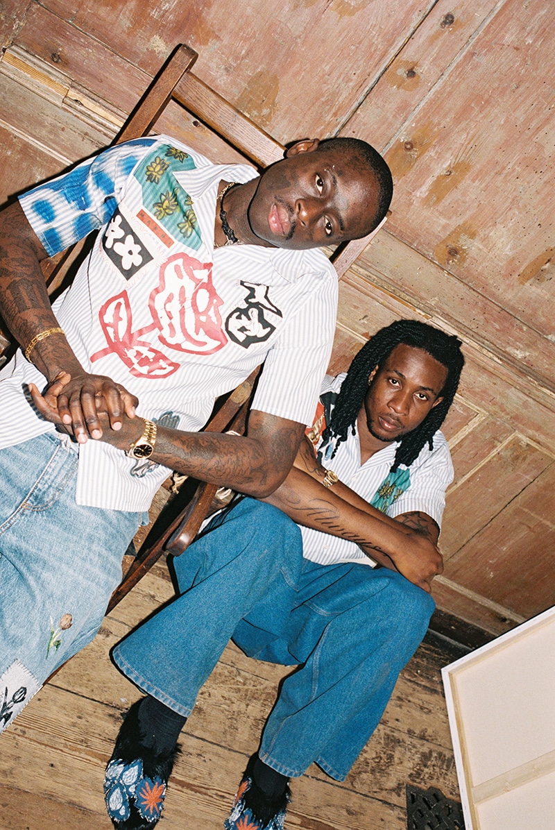
The “White” Pack reimagines Skepta’s signature Skope Forever sneaker in an arctic palette.
The question hangs heavy in the air: How do we keep making clothes when the world burns?
Haderlump’s Spring/Summer 2026 collection breathes new life into Ex Libris, translating these historical markers into wearable narratives.
Francesco Risso joined forces with artists Olaolu Slawn and Soldier Boyfriend for something raw, immediate, and deeply personal.
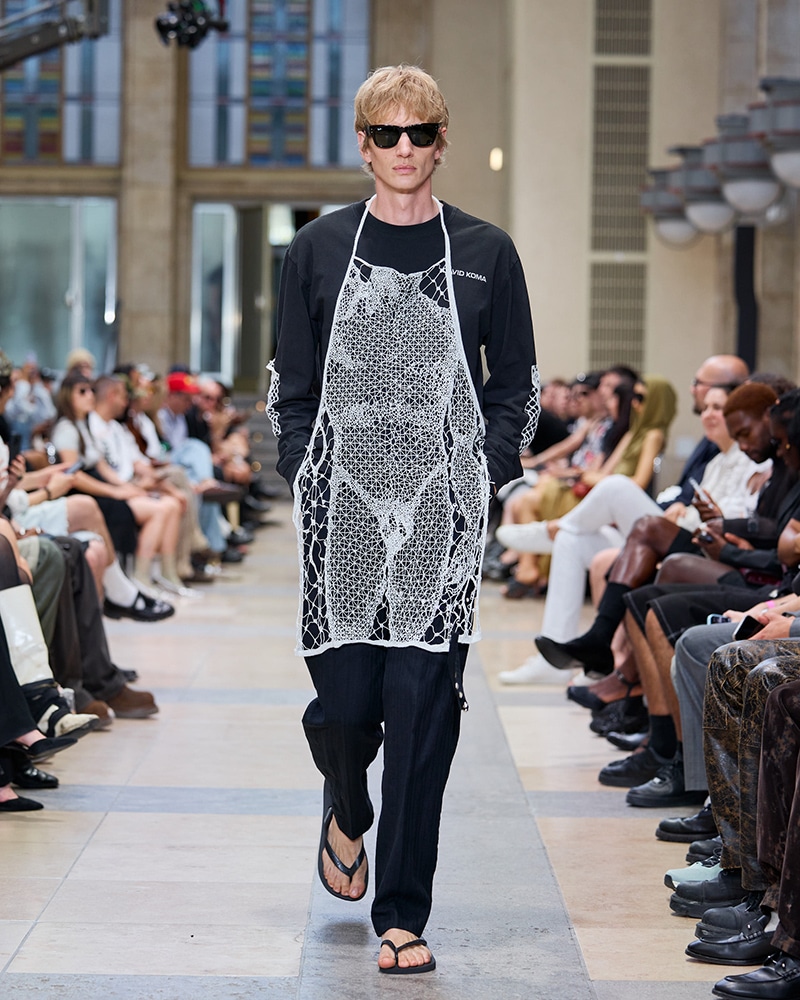
For Spring/Summer 2026, David Koma presented I LOVE DAVID at Berlin Fashion Week, a menswear collection that balances humor with depth.
SLⱯY, unveiled during Berlin Fashion Week, takes the ancient tale of Saint George and the Dragon and flips it into a meditation on modern battles.
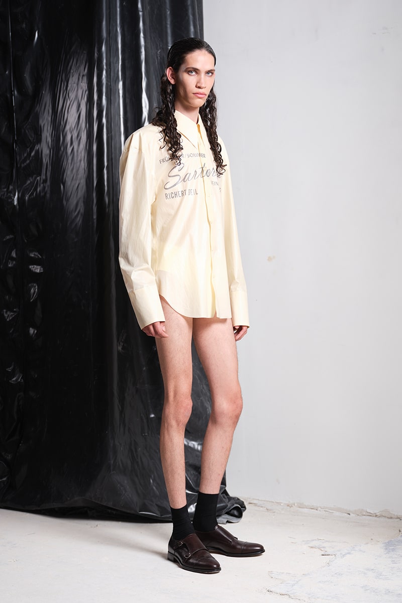
Change isn’t always about moving forward, but sometimes, it’s about holding on. For their Spring/Summer 2026 collection, Milieuschutz, Richert Beil explores exactly that tension.
Inspired by the hidden love stories of novels like Maurice, Swimming in the Dark, and Young Mungo, the collection moves through three emotional stages of queer coming-of-age: concealment, self-acceptance, and the bittersweet weight of memory.
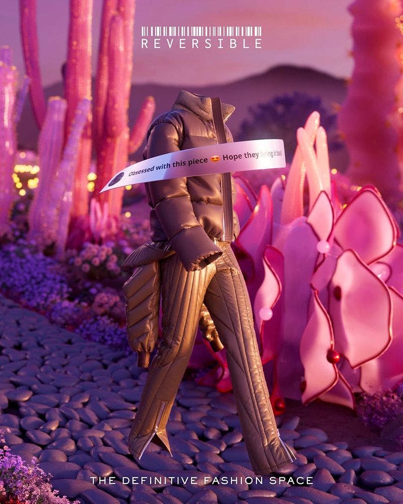
Through its new CGI campaign, “Beyond Real, Beyond Now,” and a community-driven approach, REVERSIBLE is bridging the gap between inspiration and accessibility.
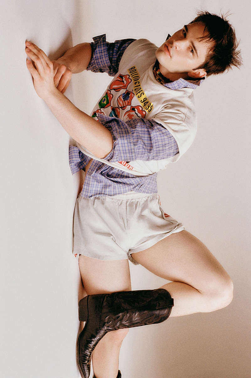
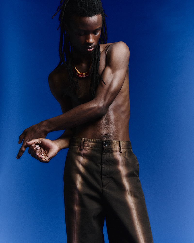
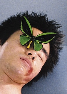
Eugenio Elverdin photographed by Lucas Ricci and styled by Gaston Olmos, in exclusive for Fucking Young! Online.
There’s a particular kind of freedom that comes with movement, and AMBUSH’s Spring/Summer 2026 collection, “Tribe on the Move,” captures that feeling.
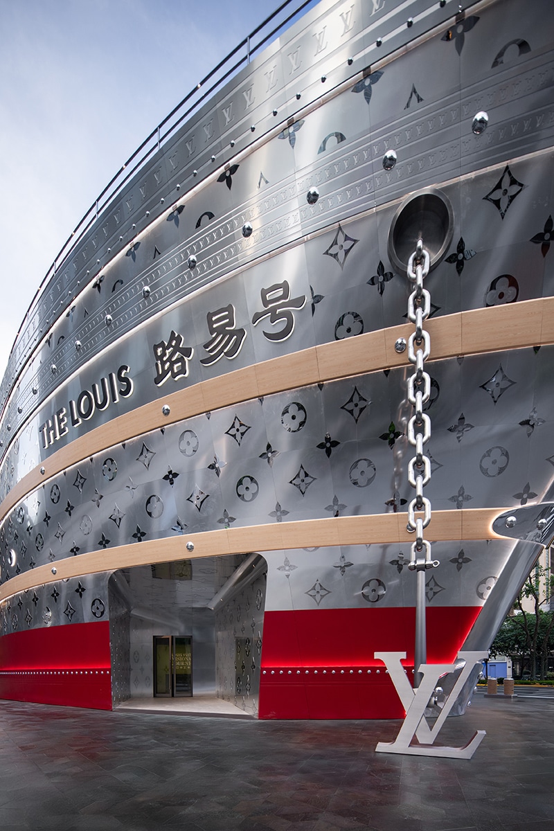
Louis Vuitton’s latest travel campaign takes viewers on a visual journey through China, reimagining travel as an experience rather than just a destination.
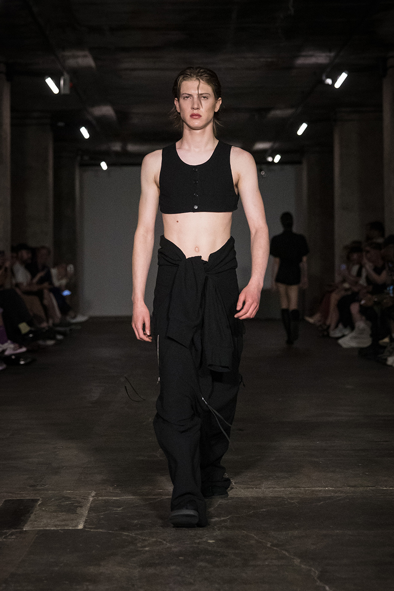
Paris Fashion Week witnessed Steven Passaro’s Moonlit Lover Spring/Summer 2026 collection, an exemplar of the aftermath of love encountered after midnight and gone before sunrise.
Because home should never be denied to anyone. In a world where home shouldn’t be a privilege but a right, artist and activist Charlie Smits is stepping up. Smits has teamed up with Fundación… »
Simon Porte Jacquemus has fulfilled his dream, and in the process, he continues to invite us to dream with him.
We checked in with Takuya Morikawa to talk process, evolution, and the foundation in the essence of creation.
Berlin Fashion Week saw the return of Milk of Lime, fresh off their Berlin Contemporary win, with their Spring/Summer 2026 collection, CHIME.
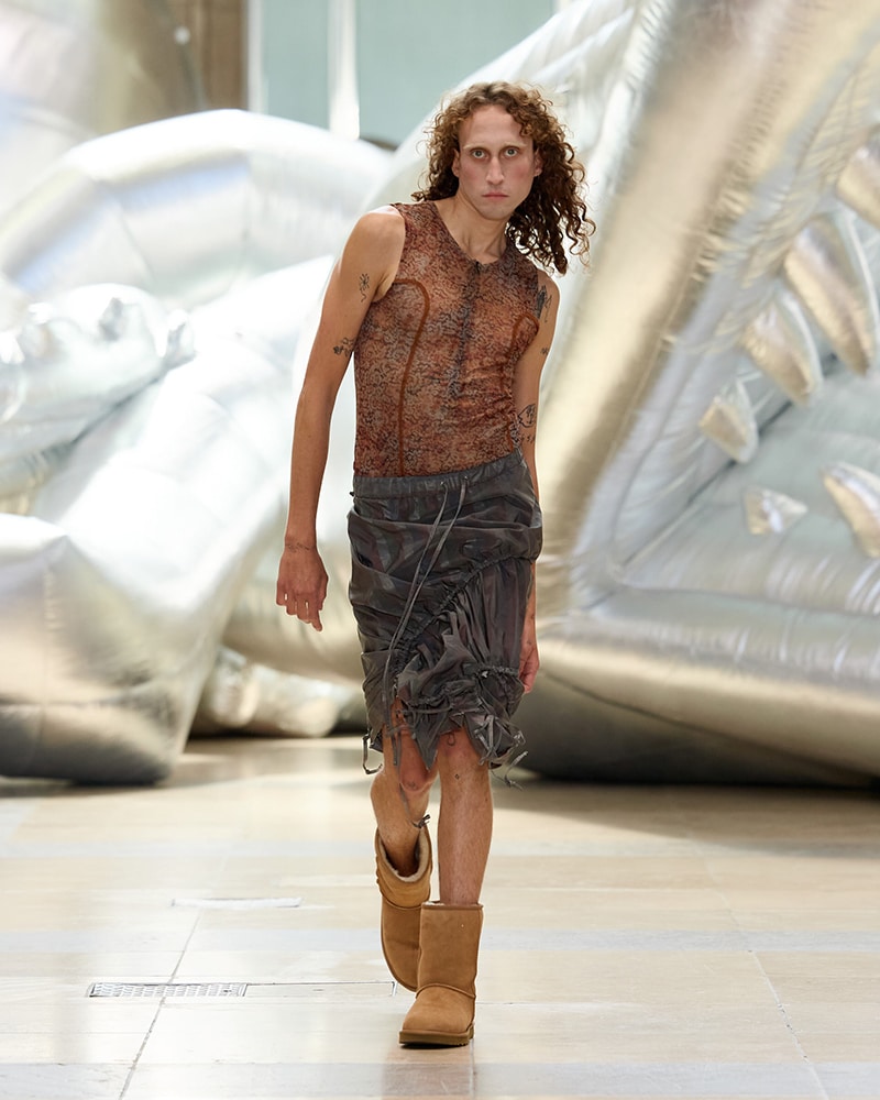
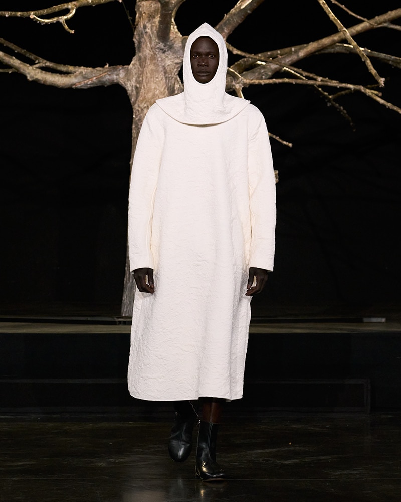
Craig Green’s Spring/Summer 2026 collection feels like a half-remembered dream with shapes you recognize, but shifted just enough to make you look twice.
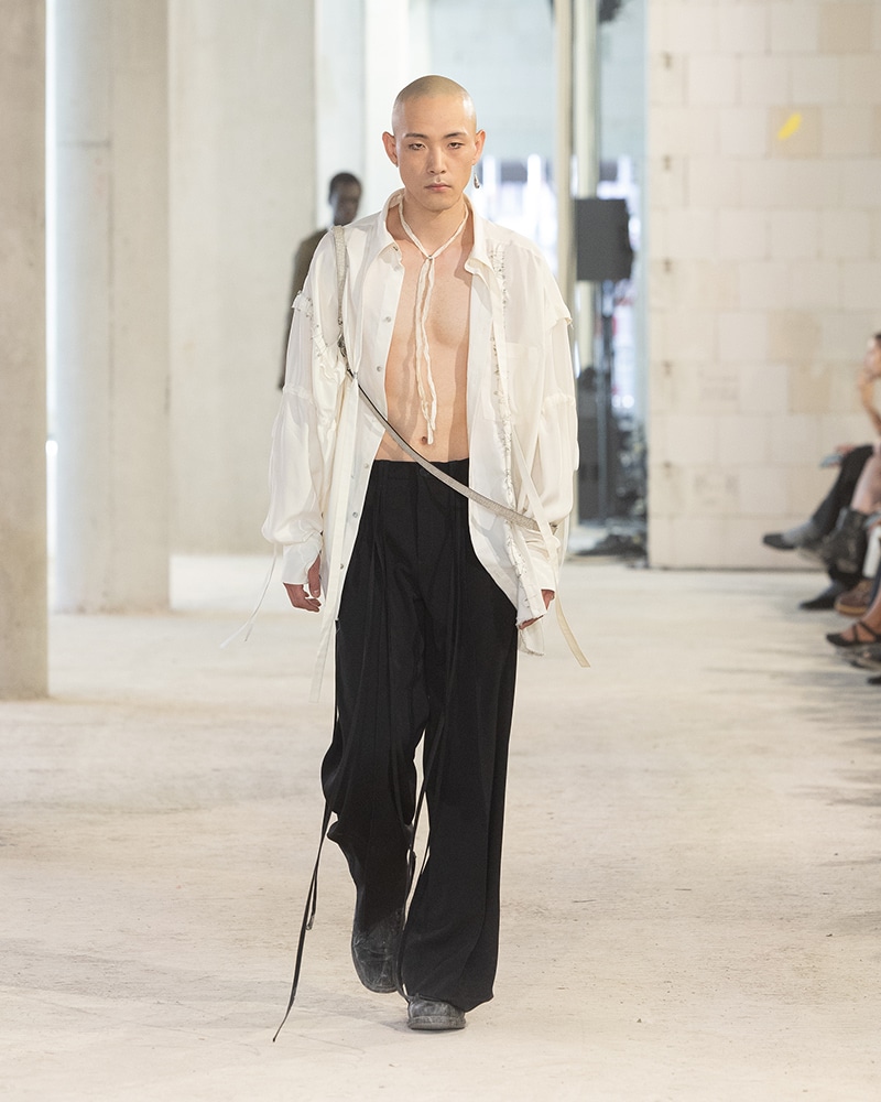
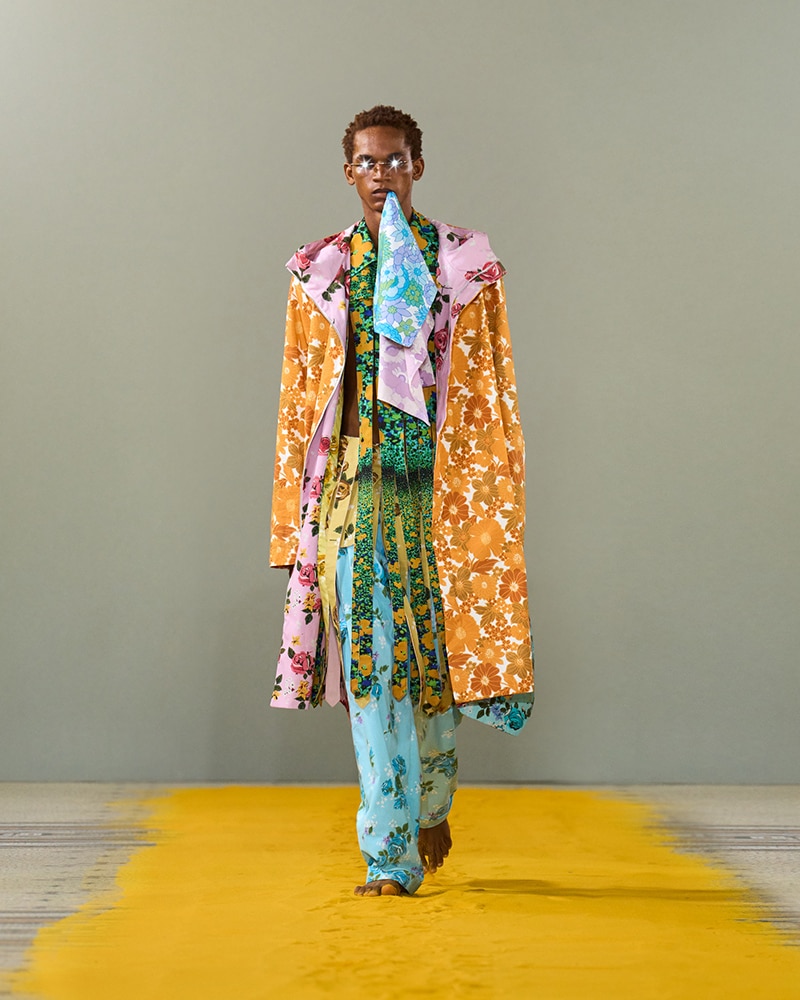
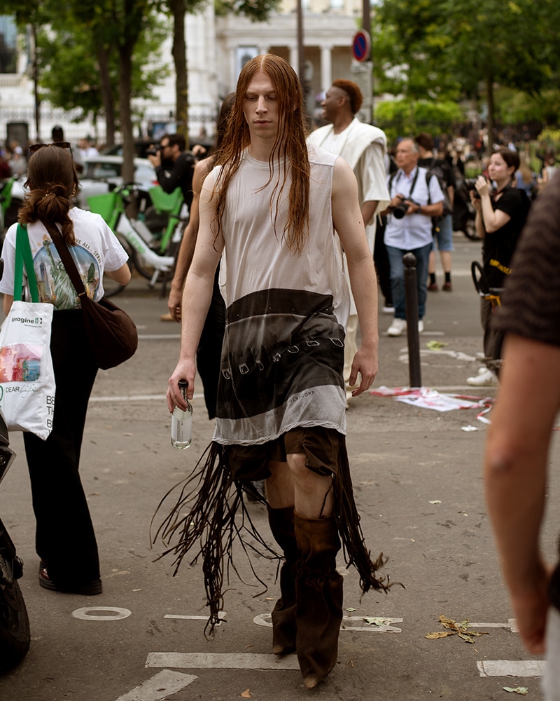
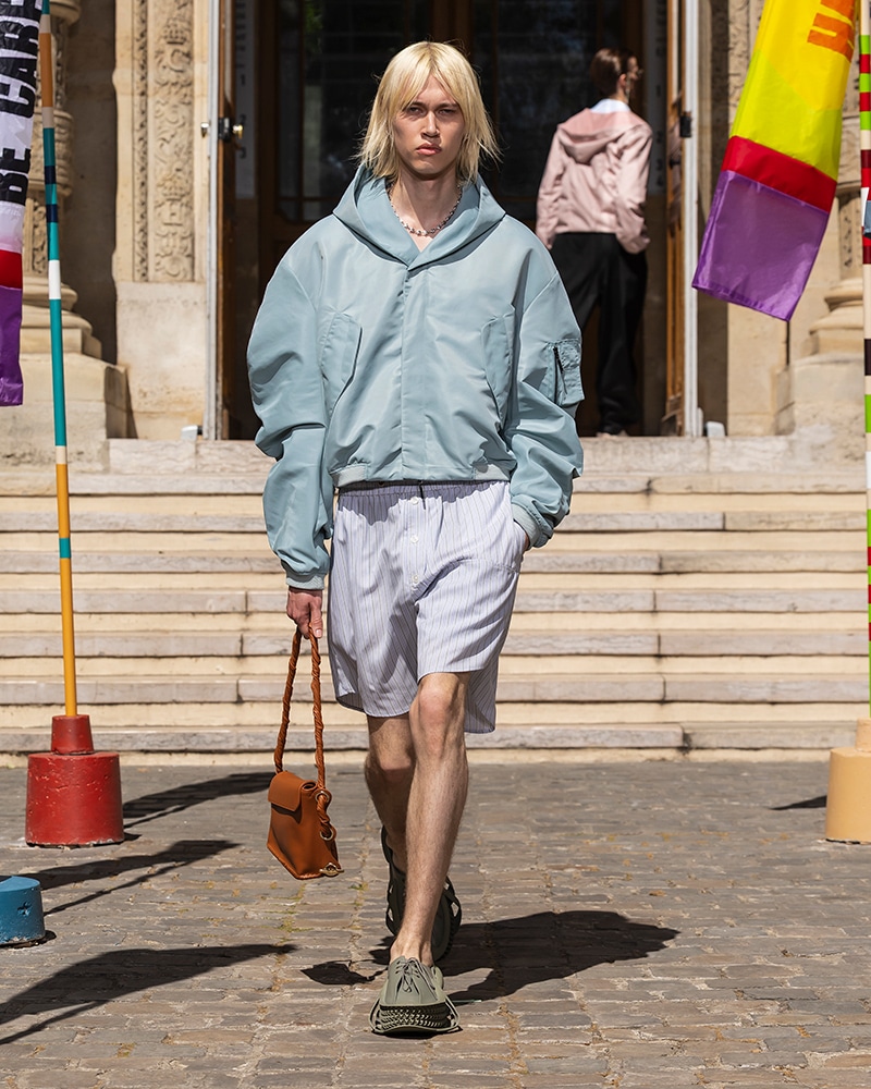
Photographer Denzil Jacobs presents a selection of eclectic looks photographed on the streets of Paris during Men’s Paris Fashion Week, outside Amiri, Rick Owens, 3.Paradis, Kidsuper and more, exclusively for Fucking Young!
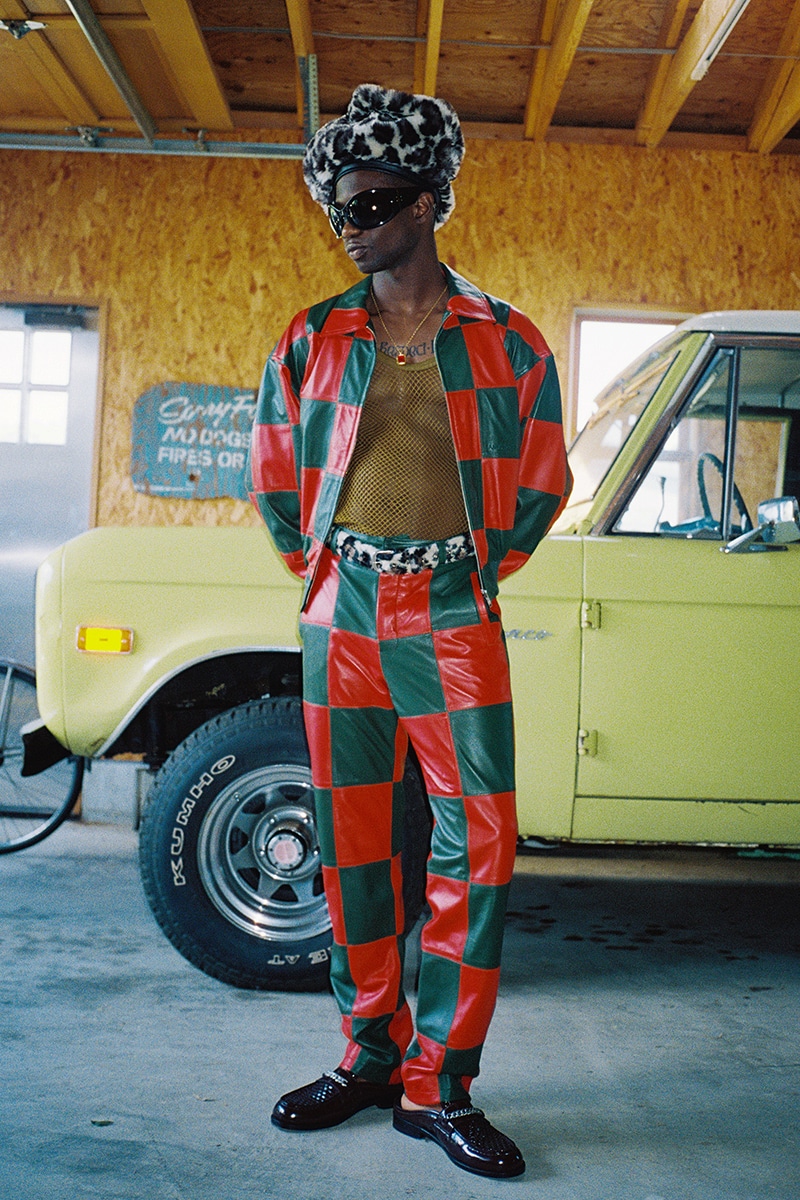
Ikko Ohira photographed by Luis May and styled by Timothée Geny La Rocca, in exclusive for Fucking Young! Online.
At Paris Men’s Fashion Week, NAMESAKE’s Spring/Summer 2026 collection, INNERCHILD, didn’t just show clothes but also memories.
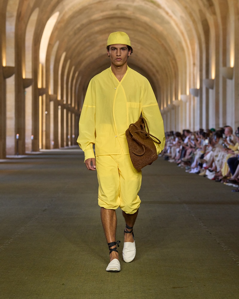
Designer Andrea Pompilio maps a wardrobe for modern nomads, one that looks collected rather than curated.
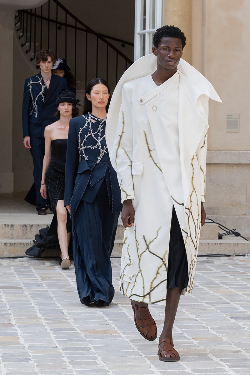
Louis Vuitton has always been about journeys, both literal and imaginative.
VIKTORANISIMOV chose an unlikely stage for its first Berlin Fashion Week presentation: a former telecommunications bunker, now The Feuerle Collection museum.
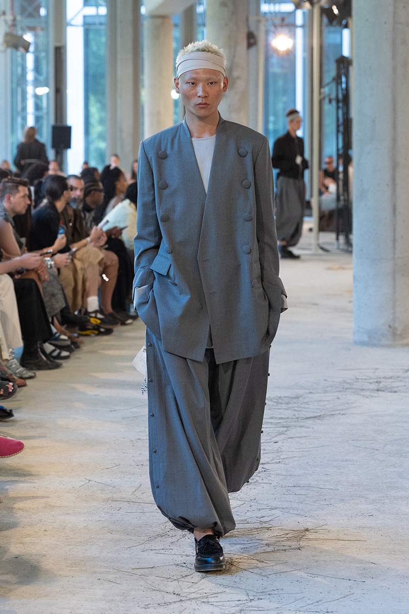
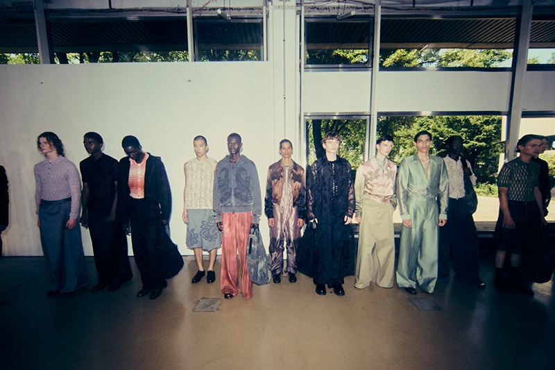
After the show, designer Feng Chen Wang caught up with us, to open up about the emotion behind this collection, and the brand’s evolving identity – accompanied by backstage moments captured by Leiya Wang.
Take a look at DOUBLET’s Spring/Summer 2026 backstage, captured by the lens of Rita Castel-Branco during Paris Fashion Week, in exclusive for Fucking Young!
Take a look at KIDSUPER’s Spring/Summer 2026 backstage, captured by the lens of Tiago Pestana during Paris Fashion Week, in exclusive for Fucking Young!
For Camiel Fortgens’ SS26, models walked the actual streets of Paris during Fashion Week, portable speakers in hand, each playing a fragment of the show’s soundtrack.
Singer-songwriter HUMBE is Mexico’s breakout pop star, leading us into a new era of sentimental pop.
Created with artist Samuel de Sabóia, the lineup weaves together regeneration, spirituality, and a question: What does the future of fashion look like?