CAMPERLAB Sheds Its Skin: A New Logo and Paris Fashion Week Debut
by Adriano Batista
CAMPERLAB is evolving, and its latest transformation comes with teeth. The Spanish brand has unveiled a sharp new visual identity, created with Milan’s Giga Design Studio, that trades familiarity for something more unsettling. Inspired by reptiles (quiet, dangerous, and always watching), the redesign twists typography into a distorted emblem of CAMPERLAB’s growing ambitions.

The new logo is austere, angular, and deliberately off-kilter. A custom typeface with razor-edged serifs and exaggerated contrasts gives the brand name an almost predatory presence. But the real statement lies in the monogram: a double “C” where the inner letter is swallowed by the outer curve, like a snake’s hinged jaw mid-strike. It’s a fitting symbol for a brand in flux: CAMPERLAB began as a footwear experiment and has since morphed into a full-fledged fashion force with its own skewed perspective.

On June 26, CAMPERLAB will debut its Spring/Summer 2026 collection at Paris Men’s Fashion Week, its first show under the new identity. If the logo is any indication, expect the unexpected: shapes that bend, details that unsettle, and a vision that refuses to sit still.
C.P. Company Supports Ivano Atzori’s New Book “Presente Continuo”
ALAINPAUL Spring/Summer 2025 Campaign
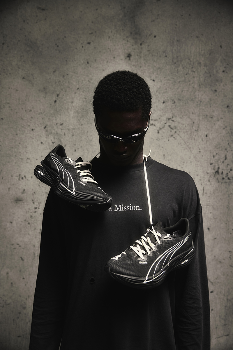
PUMA and the British fashion brand Represent have unveiled their second collaborative shoe.
Eyewear brand Vooglam has teamed up with streetwear label Tombogo for its first limited-edition collaboration.
OUR LEGACY WORK SHOP and ROA have released a new capsule collection. This marks their fourth and most extensive collaboration to date.
Chino Amobi’s new project, “Eroica II: Christian Nihilism”, marks a striking and deeply personal return from an artist known for expanding the edges of sound, image, and storytelling.
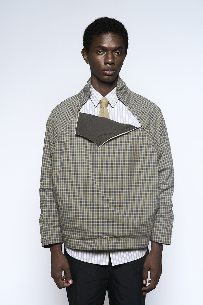
The work is part of the brand’s ongoing research into biomimicry, material science, and textile technology.
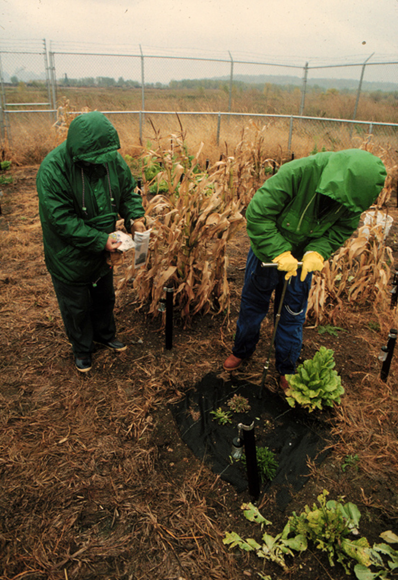
Arts of the Earth at the Guggenheim Museum Bilbao is an ambitious exhibition on humanity’s shifting relationship with our planet, soil, and biodiversity.
We talk to Callum Eaton about tension, humour and the objects that inspire his new exhibition.
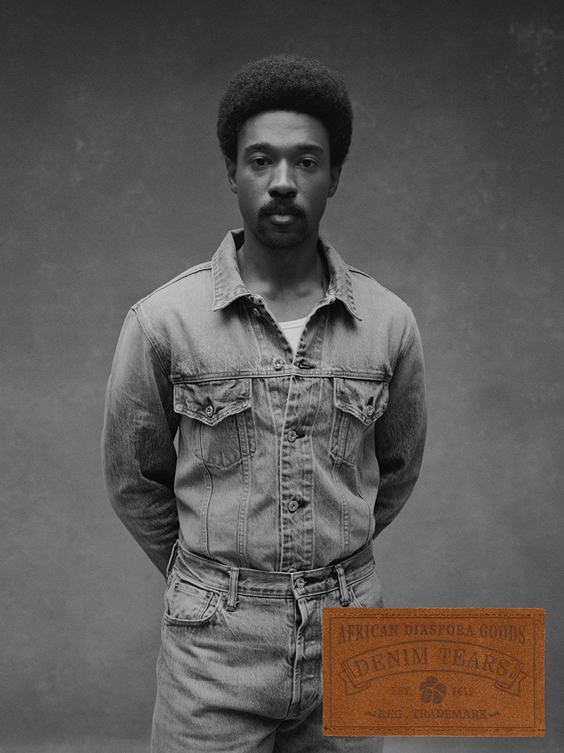
Denim Tears has launched its own proprietary line of denim, titled DENIM TEARS DENIM BY DENIM TEARS.
Inspired by the folklore and spirit of flamenco, the collection captures the movement and emotion of the dance through silhouettes, contrasts, and details.
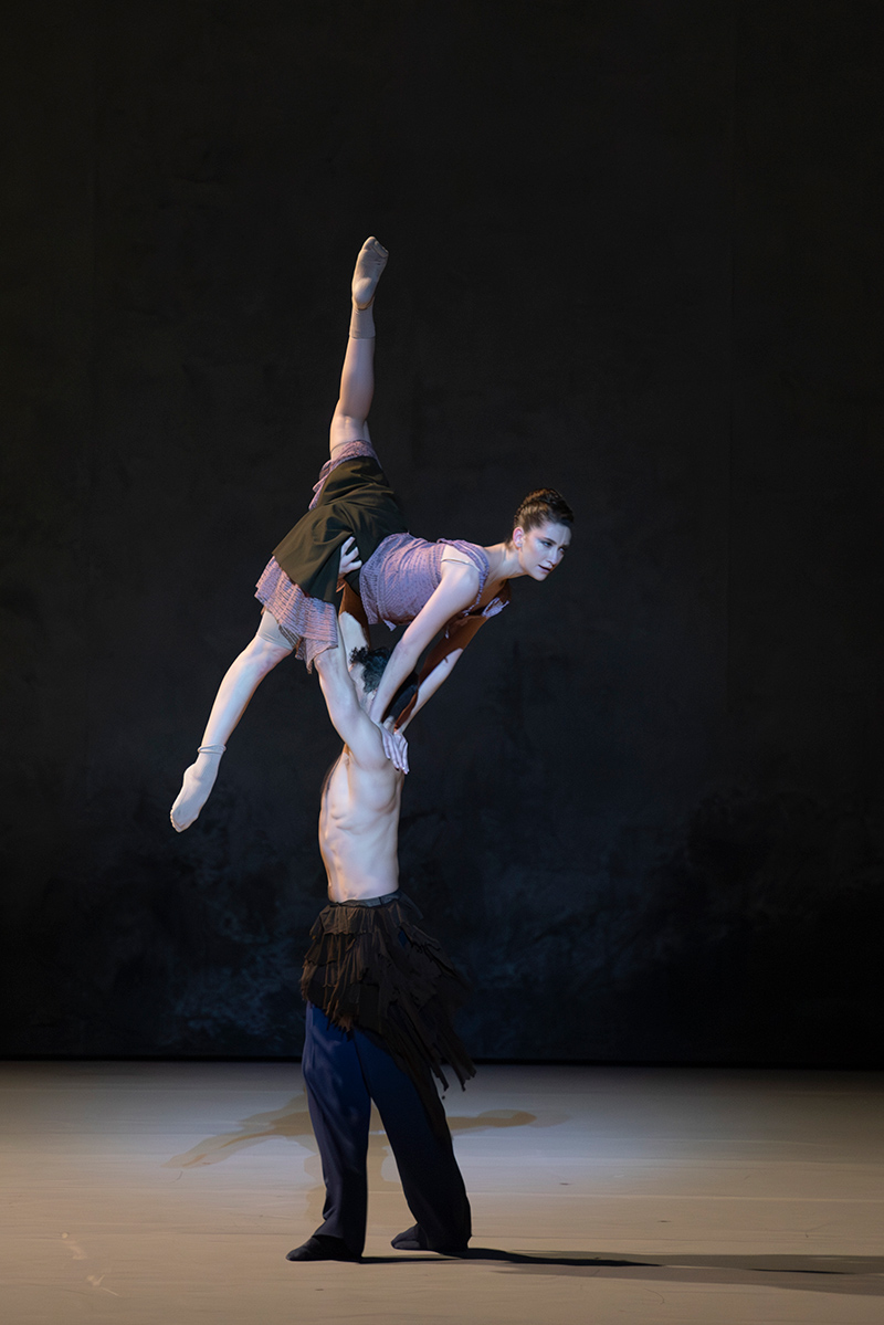
ALAINPAUL has created the costumes for a new ballet, Drift Wood, at the Opéra national de Paris.
MODUS VIVENDI presents its Fall-Winter Black and White edition, a collection that drifts in from a retro art universe and lands right inside the pulse of modern urban life. The vibe is graphic, fluid and inclusive, as… »
We put together this last-minute holiday gift guide built around the things we actually love to give (and receive).
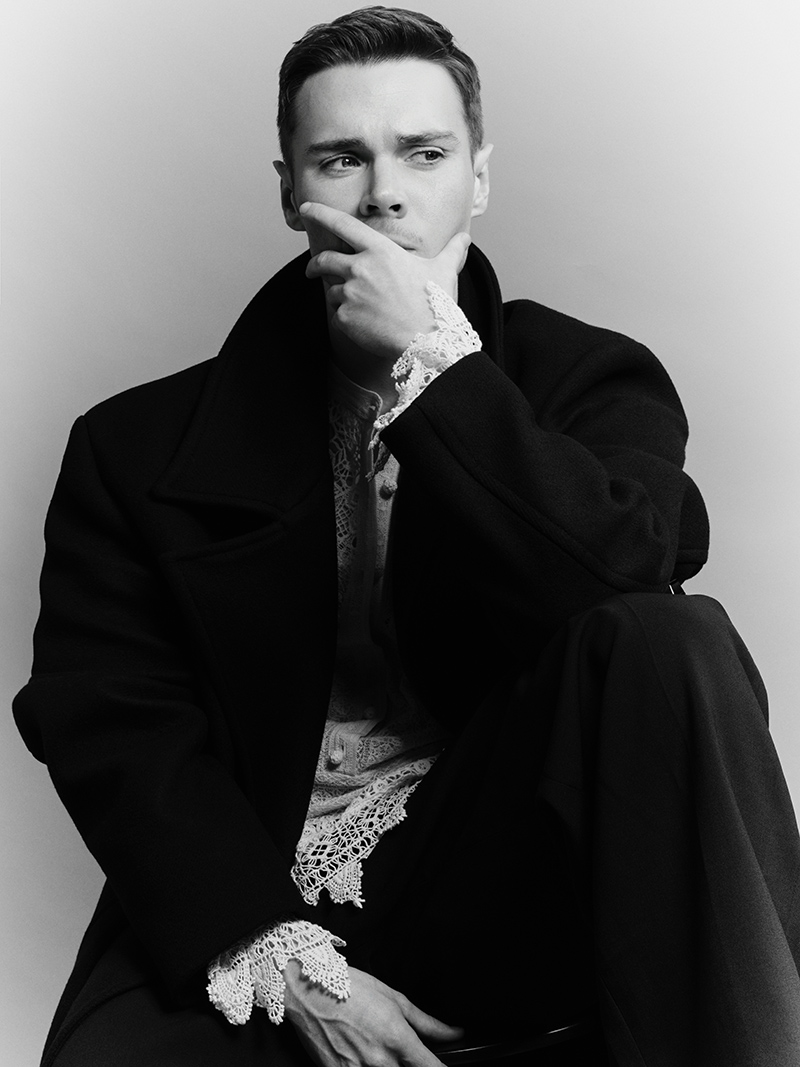
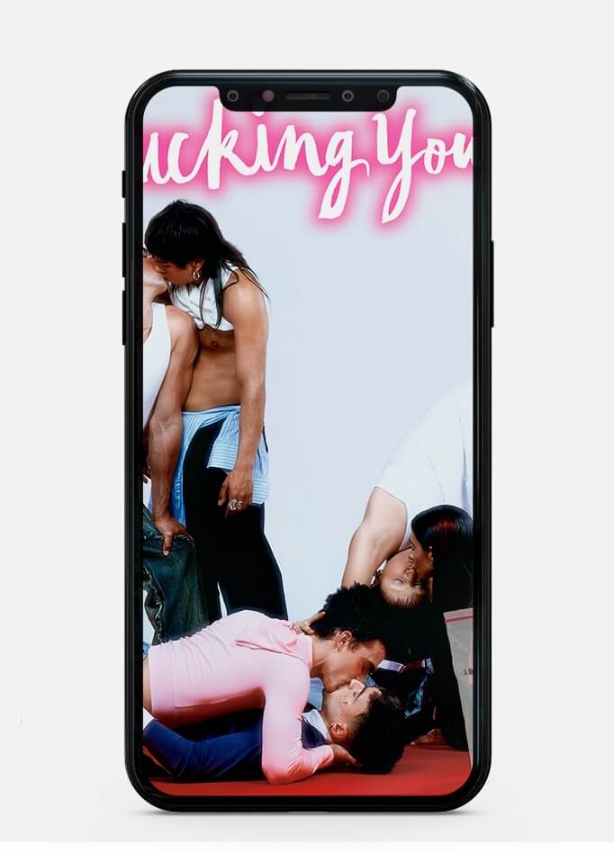
Jack Archer photographed and styled by Julian Freyberg, in exclusive for Fucking Young! Online.
Ten pieces that say: You tried to erase us. Here we are anyway. And we’re making clothes loud enough to wake the whole city.
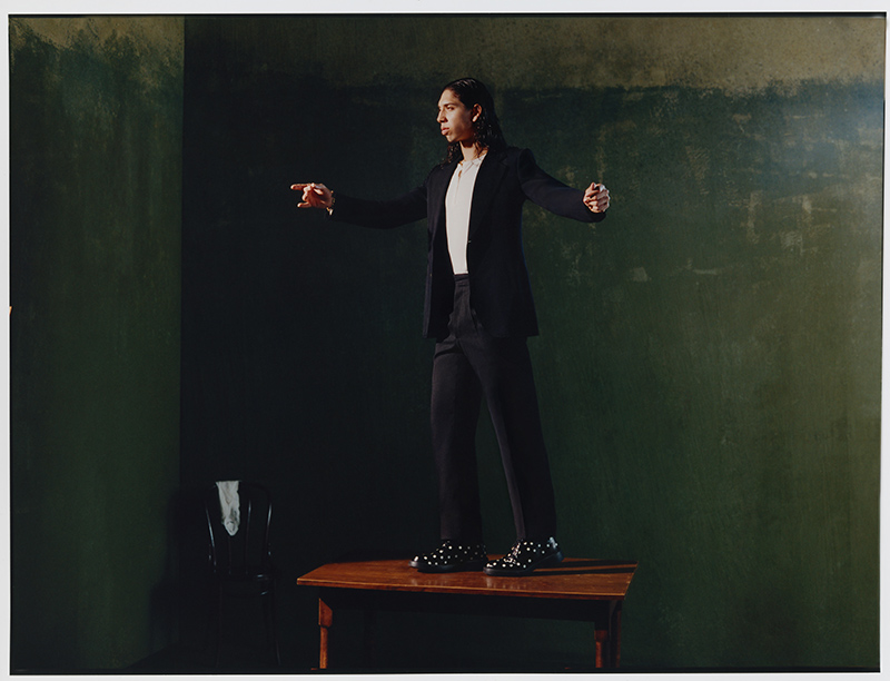
There’s a quiet light that runs through Óscar Casas’ work, an energy that feels both instinctive and deliberate, like someone who has learned to move between dream and reality with ease.
Heron Preston has officially relaunched his namesake fashion label.
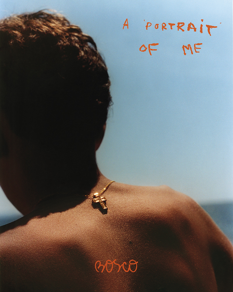
Bosco travels with an analog camera not just to document places, but to understand them.
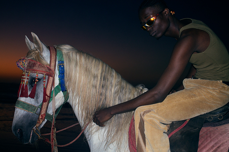
Casablanca presents its Resort 2026 campaign, shifting its focus to Los Angeles.
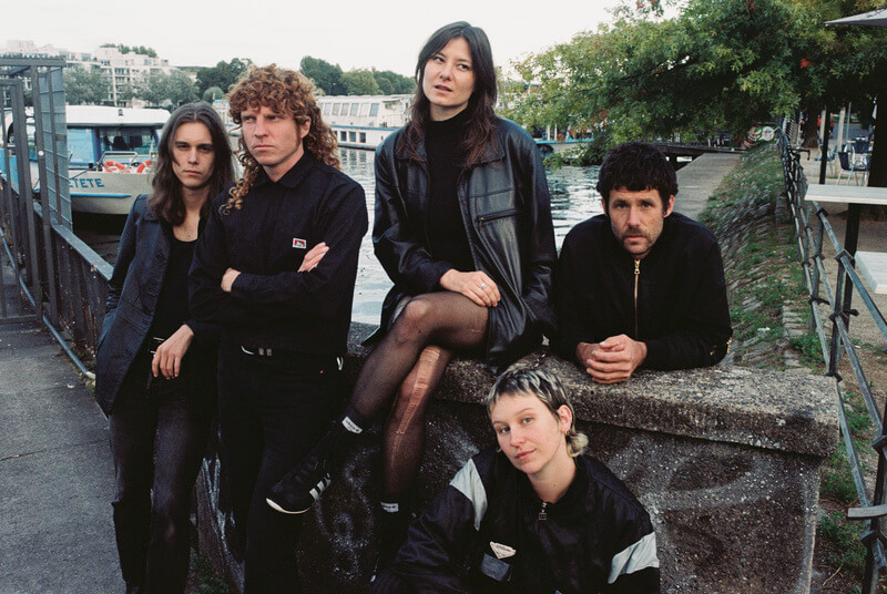
Out of Australia’s sticky summer nights comes Full Flower Moon Band — a name that’s gone from whispered cult obsession to one of the country’s most ferocious live exports.
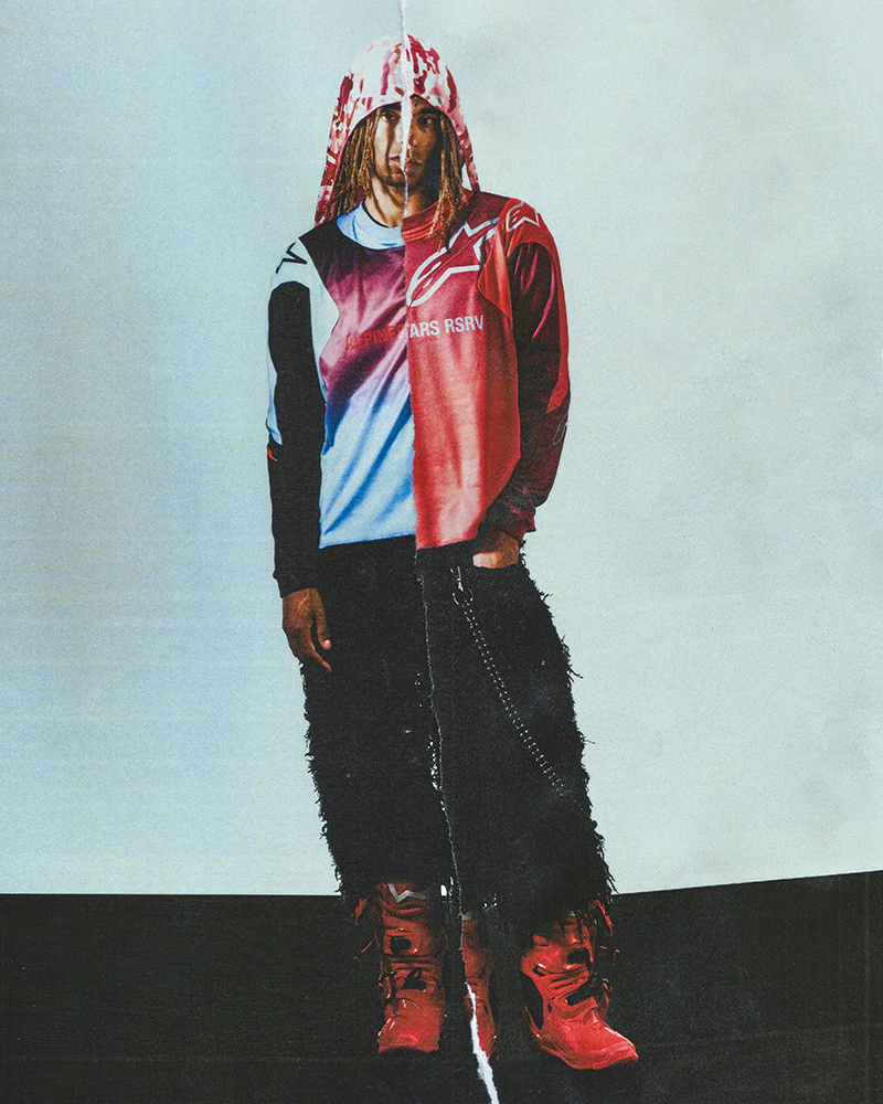
The project offers a perspective on transformation, giving a second life to materials shaped by use in motorsports.
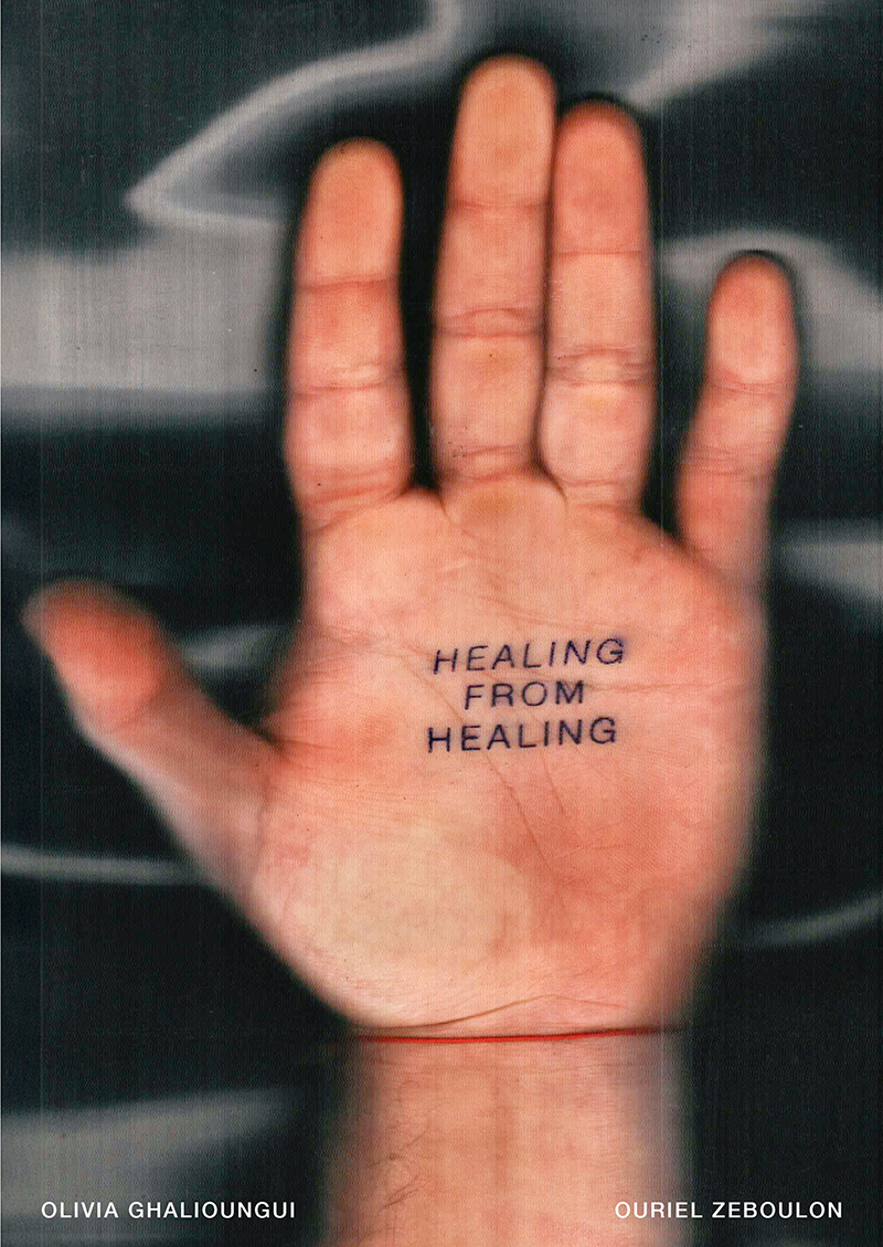
Together with Olivia and Ouriel, we met up in Paris to discuss creativity, criticism and the importance for artists to collaborate.
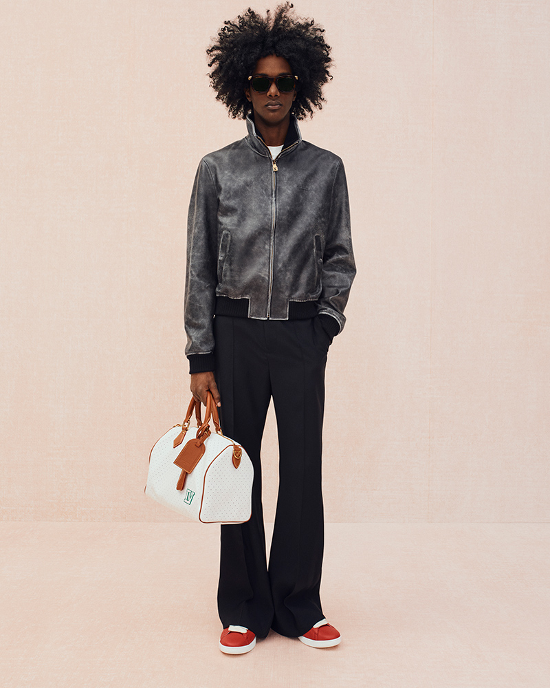
For the Louis Vuitton Pre-Fall 2026 collection, Creative Director Pharrell Williams turns his focus to Central Park in New York.
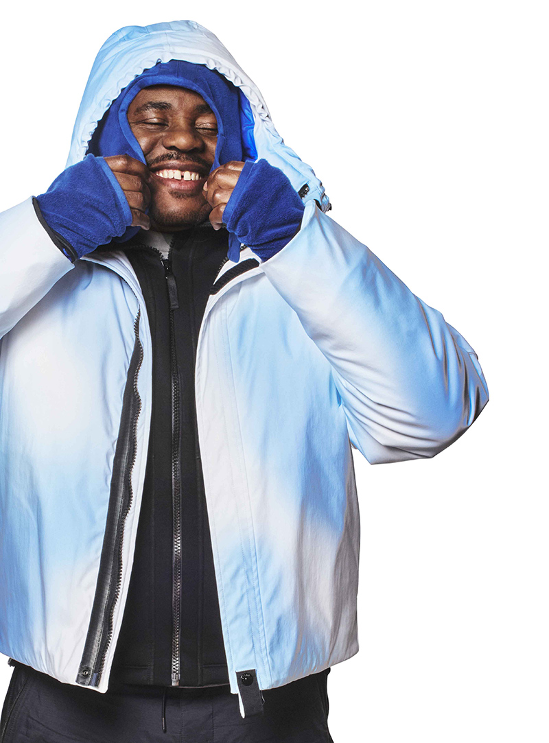
Moncler Grenoble presents its Fall/Winter 2025 collection, uniting high-performance design with metropolitan style for modern mountain life.
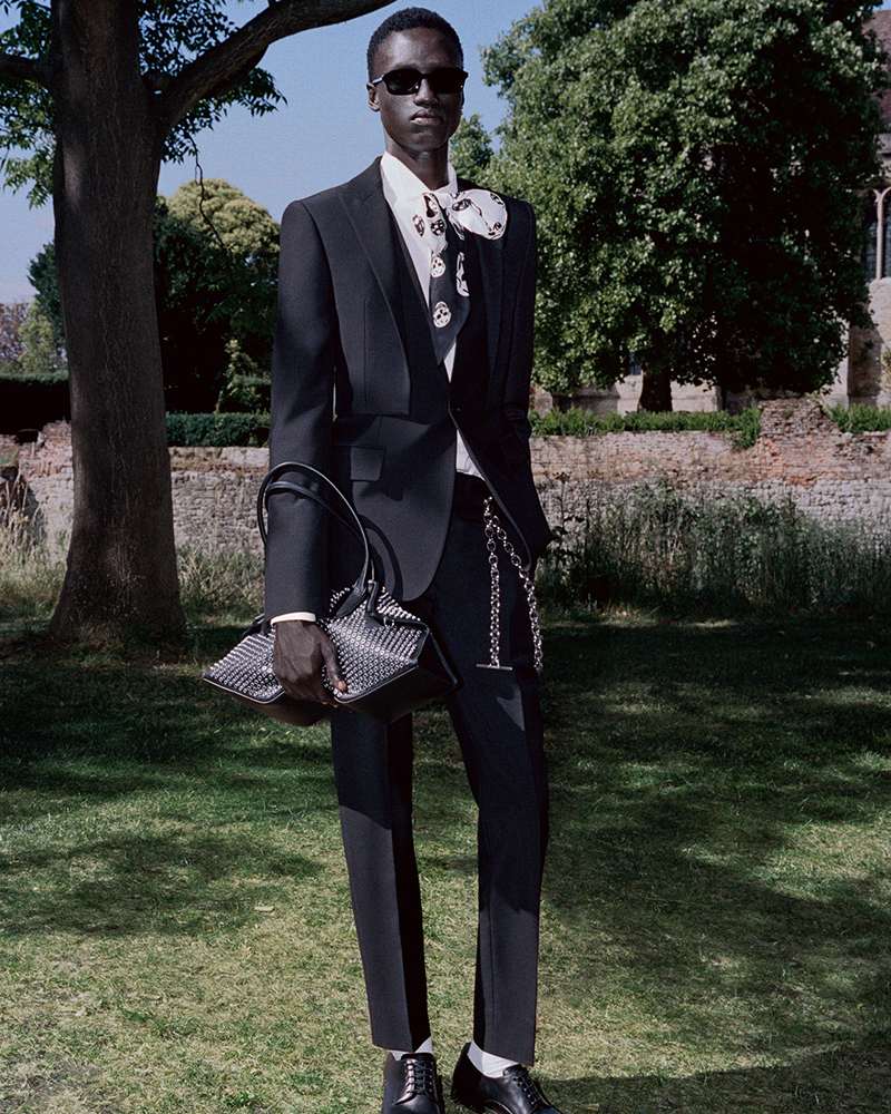
The McQueen Spring/Summer 2026 Pre-Collection is set against the backdrop of Eltham Palace.
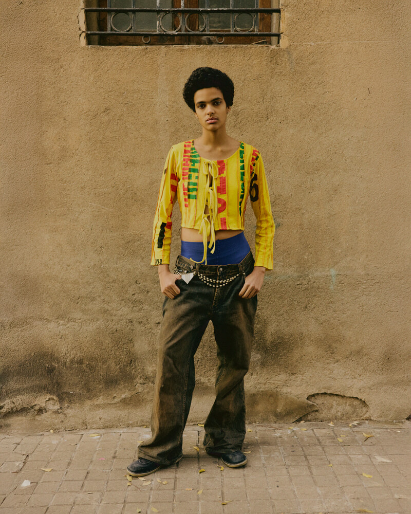
Jen Deleusse at UNO Models shot by Camilo Delpin and styled by Celia Villa, in exclusive for Fucking Young! Online.
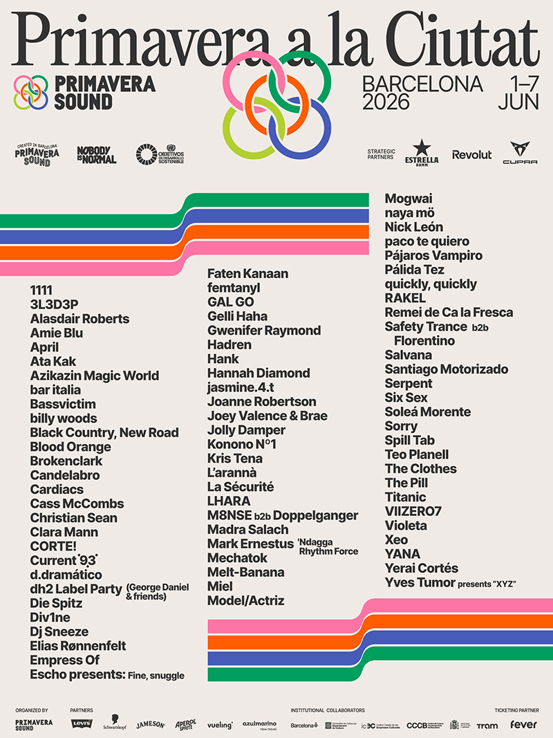
Primavera Sound Barcelona has announced the line-up for its parallel programme, Primavera a la Ciutat, further expanding its 2026 edition.
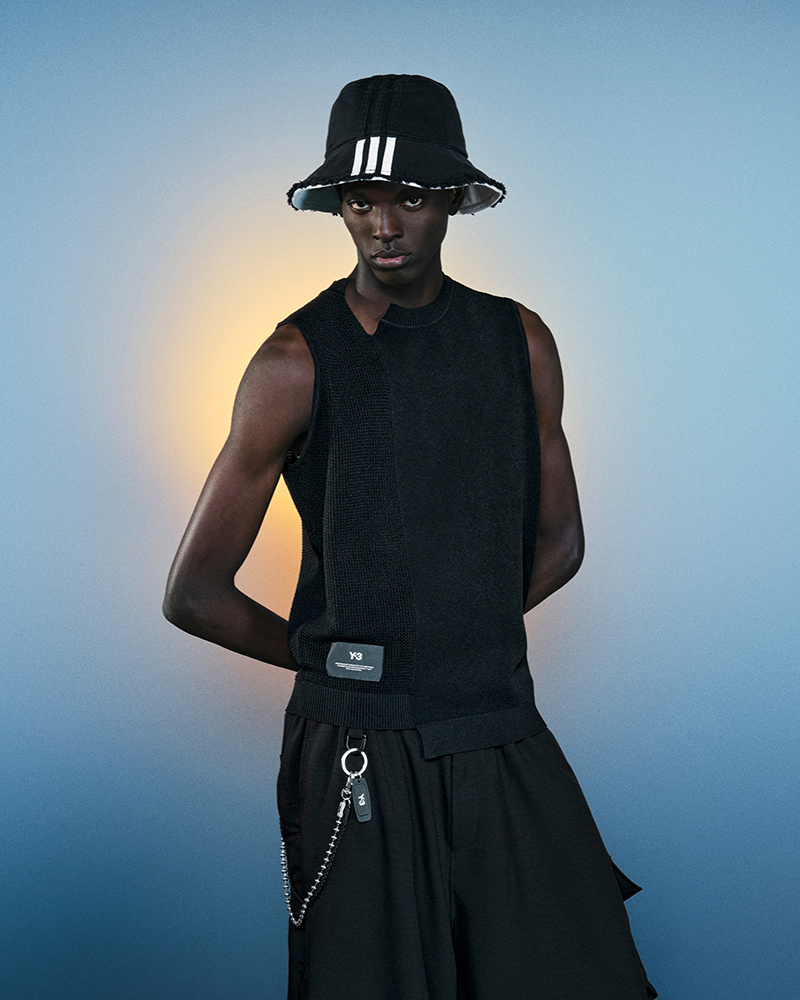
Y-3 presents the first chapter of its Spring/Summer 2026 collection and accompanying lookbook.
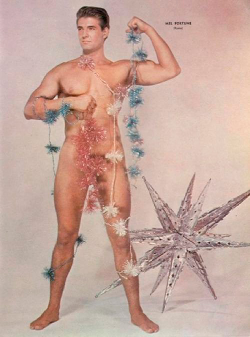
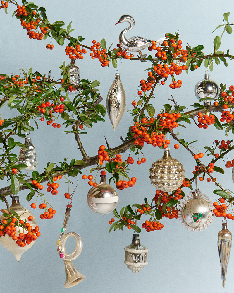
JW Anderson has released its Winter 2025 collection of Christmas ornaments.
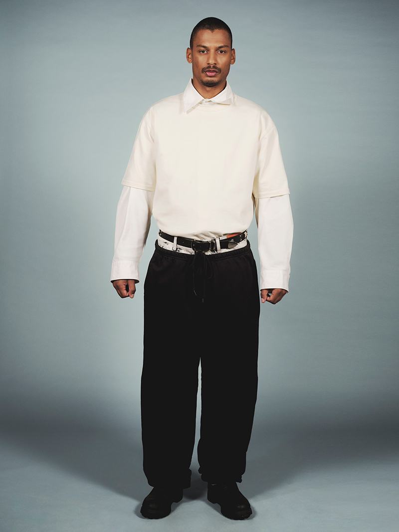
Prince and Didi captured by the lens of Axelle Patard, in exclusive for Fucking Young! Online.
Stone Island revisits its iconic Ice Jacket for Fall/Winter 2025-26.