Rachel James
Rachel JAMES, high-end menswear label, was brought to life, in 2014, by Rachel James and Tom Ings. The emerging creative duo greatly regards quality and research, carrying out the design and manufacturing process in the United Kingdom.
Deep red, black and white, acid green.
Rachel JAMES developed its aesthetic ethos on the concept of “creative yet controlled, sleek yet crazy”.
Merino wool and waterproof technical fibres.
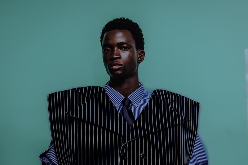
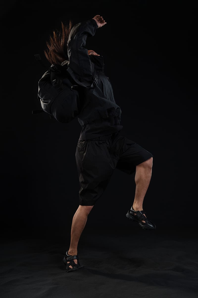
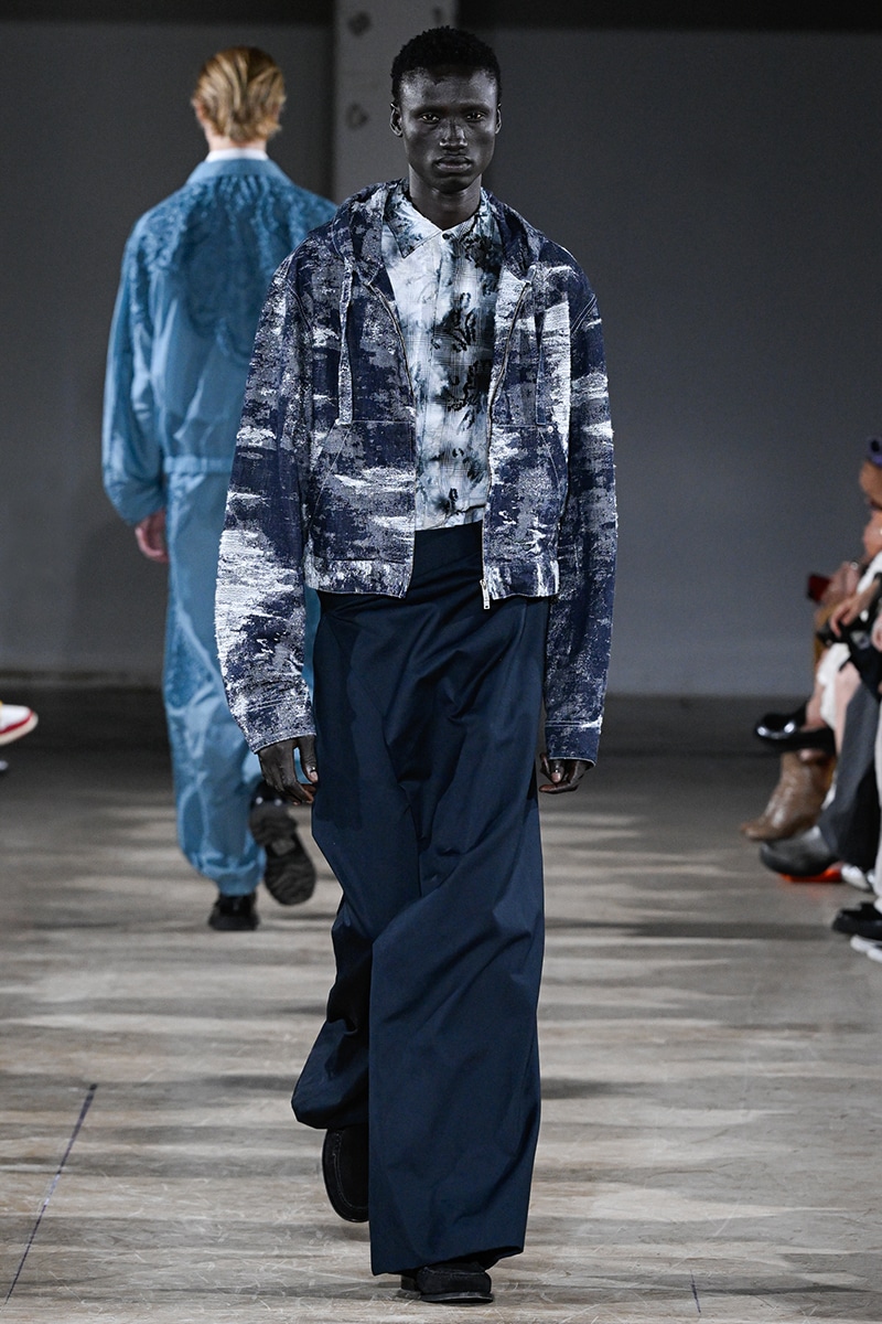
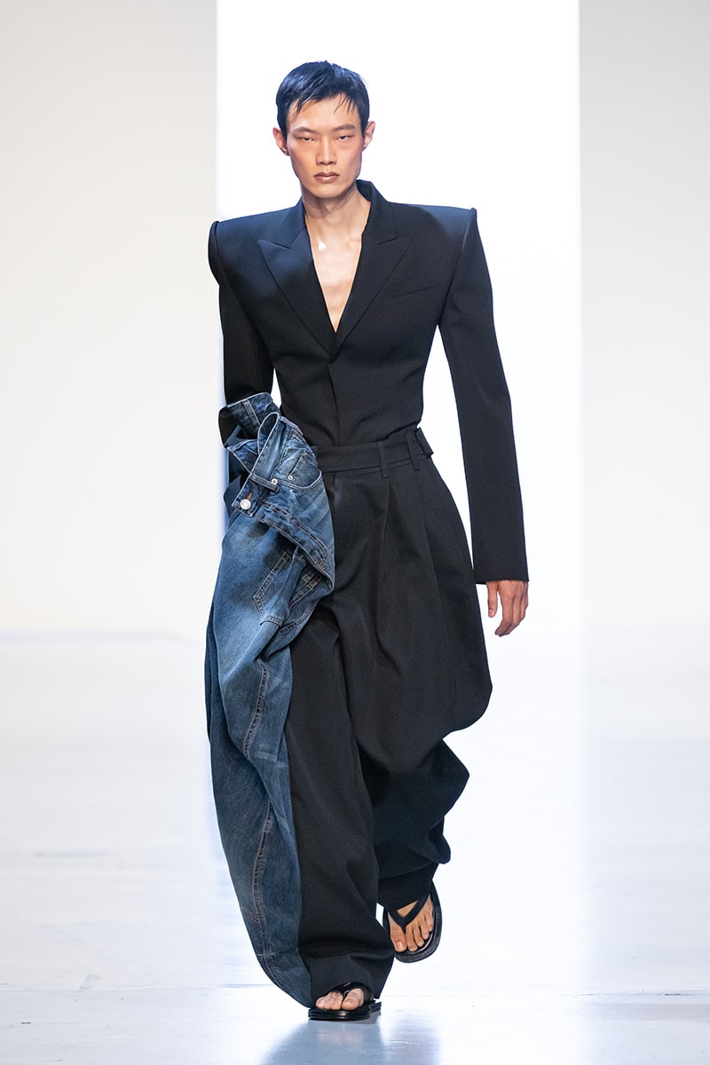
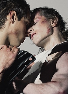
Rachel JAMES AW16 Menswear collection – “Glitch” – draws inspiration from technical glitches and digital images, offering a sporty but cool look.

Fucking Young!: Hello Rachel, would you introduce us to your background?
Rachel JAMES: I’m a menswear fashion designer. I studied BA Fashion Design at the University of Westminster and interned at Acne Studios, Josh Goot and Todd Lynn. These placements meant that I lived in Stockholm and Sydney for a while (I’ve always loved travelling and getting to know new places). I live in London now, but I am originally a country girl.
FY!: Could you, please, illustrate your “creative yet controlled, sleek yet crazy” philosophy?
RJ: What makes my work distinctive is the balance between innovation and functionality. Creative yet controlled. It is about balancing a concept with a real and basic garment. I always like to have elements of mass creativity or madness in designing, but then I will strip it back again.
FY!: Contrasting colours and “disruptive but deliberate” ideas: is innovation about antithesis?
RJ: Not necessarily, but as I said before, there is always an element of antithesis in the way I approach a concept (the concept itself can be anything I’m attracted to at the time). I absorb the product of my research, think about it, trial “things” and eventually end with innovative designs that embody my trademark sense of antithesis.
FY!: Is “Glitch”, Rachel JAMES AW16 Menswear collection, built on a sense of vertigo?
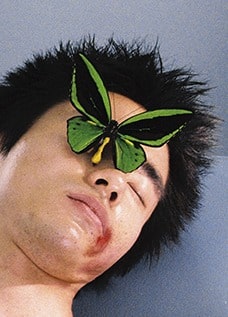
RJ: The collection definitely has, at its core, the will to make people feel sick or uncomfortable. I was intrigued by how certain pixellated images, colour combinations and glitches can jar people’s eyesight or make them feel dizzy. I thought it would have been interesting to take on visuals that were considered uncomfortable and make them deliberate and attractive.

FY!: White noise, fragmented pixels, distorted shapes: what fascinates you about technology?
RJ: Rachel JAMES SS16 Menswear Collection involved hand-drawn prints, so I wanted to swing in the opposite direction (the brand is known for bright prints and I am always looking for excitingly new ways of creating them). It was a lot of fun making them digital and graphic as it meant they could be altered, broken and warped so easily yet with such a precision. The technological component gave the aesthetic a colder, less human feel, that really worked for the concept. I also named the styles after computer viruses.
FY!: Could you, please, complete the following sentence: “I believe in…”?
RJ: I believe in energy. Things happen because of energy. Life happens because of energy. It may sound obvious, but I find it very comforting that the world changes every single moment and energy is constantly evolving. It reminds me to stop in the moment. Nothing is set in stone. it inspires me about what could happen in the future.
FY!: Are you influenced by fashion and cultural trends?
RJ: Yes and no. I love fashion, so I am always checking what other designers are doing: it is always a source of inspiration. I love walking around “Dover Street Market” and having a look at international fashion designers’ creations, seeing their thoughts and craftsmanship up close. Cultural trends, less so. They change from country to country and I am still working out my strongest markets, so I don’t really see them as very relevant. I just do my thing, really.
FY!: What is the most representative look of the collection?
RJ: I would say my “stoned” printed shirt and my “bomber” red checked gathered pants. The shirt has a white noise print with contrasting black and red glitchy panels (the concept is contained within a basic, fitted garment). Then, the “bomber” pants – a pair of oversized cropped trousers with welt pockets – have a creative pattern cutting, which is inspired by fun shapes and Japanese streetwear (the cut makes the red checks move and appear to flicker). You see the look and the “glitch” concept entirely, yet they are still individually wearable street pieces.

FY!: Are you interested in deepening the investigation of Japanese streetwear?
RJ: Yes, indeed. I find Japan incredibly inspiring and would love to go there in person. Japanese streetwear often involves unusual fabrics, creative pattern cutting and fun colour combinations whilst always being wearable and understatedly cool, which is exactly our brand vision. I would like to further understand the country, the market and the street scene in order to strengthen our aesthetic identity.
FY!: Could you, please, let us get a glimpse of your dreams? Any future goals?
RJ: I am really keen to work on collaborations, moving forward. So, watch this space!
FY!: Do you feel the need of a more intuitive approach to fashion? Do you think designers, journalists, buyers are paying excessive attention to concepts and abstract constructions?
RJ: I think there is definitely a strong bias towards conceptual design in terms of what the industry expects to see from emerging graduates and designers. There is such a saturated market of upcoming talent that you are encouraged to be different and quirky to stand out from the crowd. This isn’t necessarily negative, but I think it is misleading to believe that it represents the only way to be successful: everyone has their own path.
FY!: Last question: what’s today really FUCKING YOUNG!?
RJ: Mistakes that end up being totally amazing.