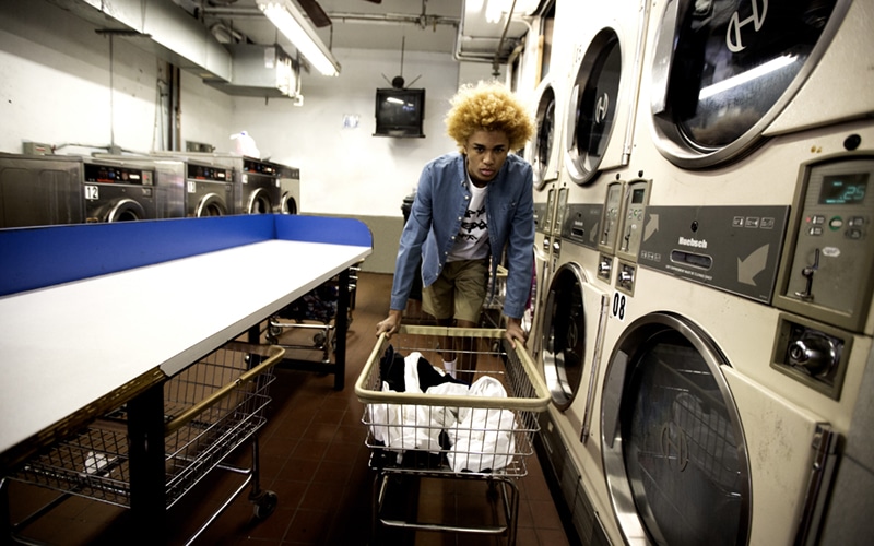
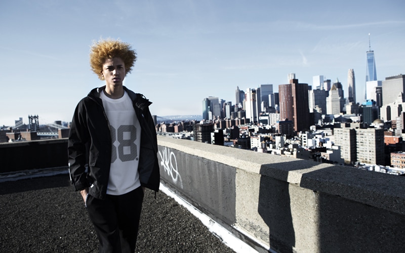
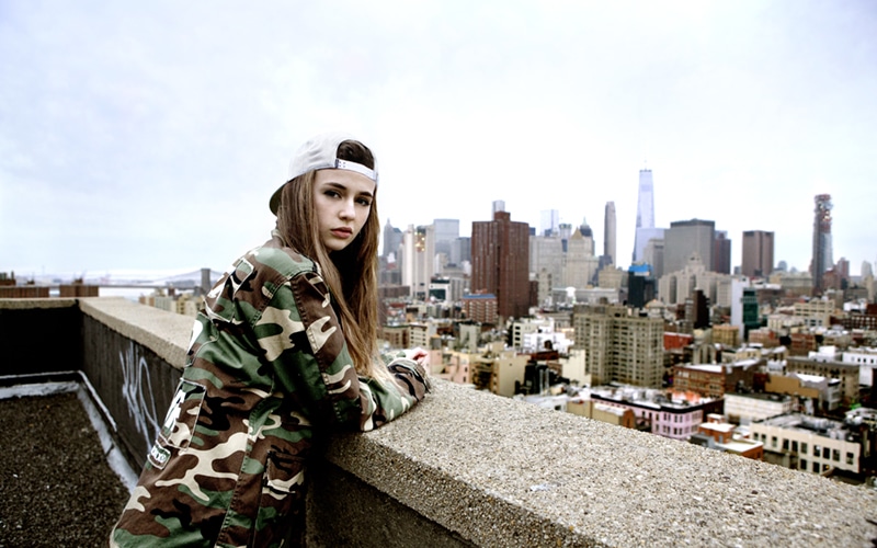
This year’s fingercroxx Spring/Summer collection explores a range of American urban styles. The menswear – modelled by up and coming potential fashion icon Michael Lockley – is themed with Battle, Graffiti and Back to the Future. The ladies collection embraces the vibrant city and the lazy beach with two themes: City Traffic and Summer Vacation.
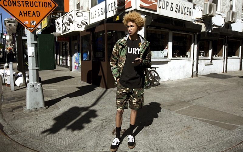
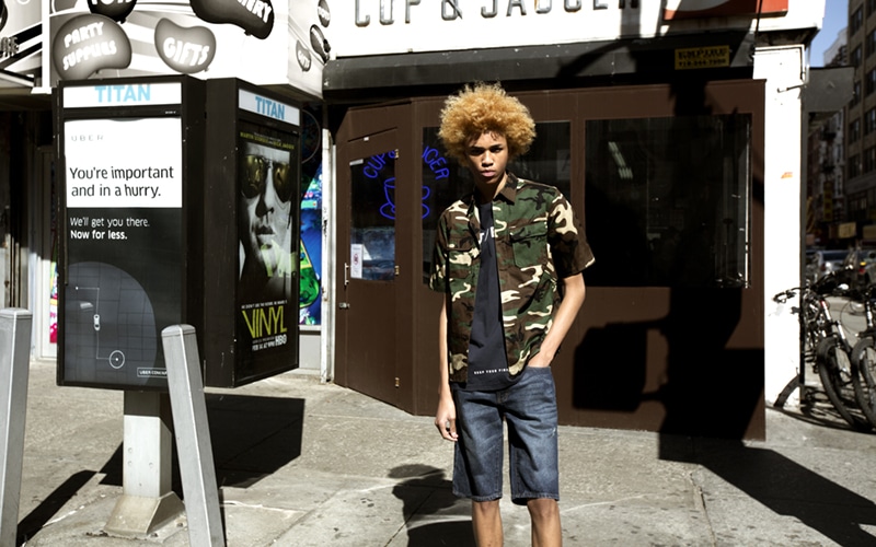
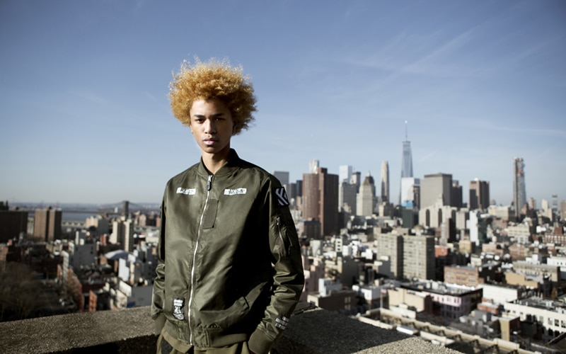
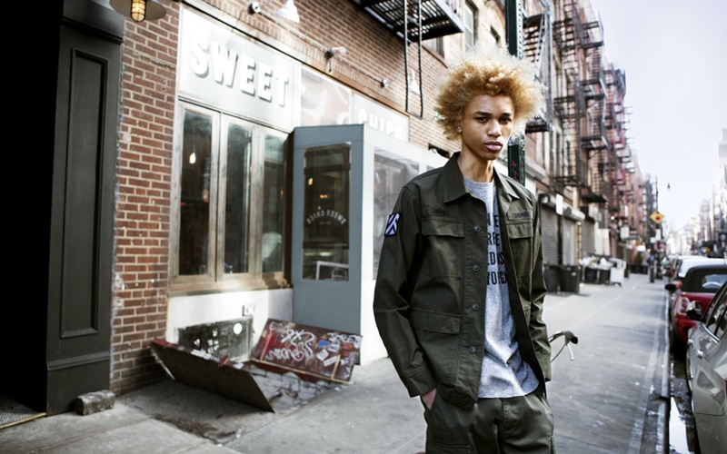
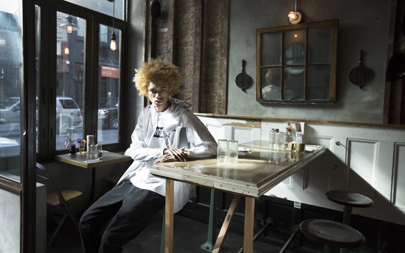
The Battle War
‘The Battle War’ continues the winning streak of fingercroxx by renewing the brand’s quintessential military style. Taking cue from wars, the WWII and tank battles in particular, the collection outlines the land battle motif with a palette of earth tones — khaki, military green and camo prints inclusive. In the WWII, many famous tank battles were named after the key manoeuvring tanks. In view of this, the collection centres around military badge- and tank graffiti-inspired motifs, complemented by the tyre mark of the tank and key names/jargons in tank battles of the era. Among the centrepieces of the collection, the four-pocket military shirt and jacket represent the most updated interpretation of military style.
City Traffic
The hustle bustle of the city traffic is represented by numeric figures, warning messages and graphics on roadside signposts. Warning signs such as ‘GIVE WAY’, ‘SLOW DOWN’ and ‘LOOK RIGHT’, as well as the yellow ‘NO PARKING’ sign frequently seen in parking lots and the image of the traffic cone pop up as the motifs of the collection. The usual colours of these signs: red, blue and yellow join together to touch up the street-inspired collection.
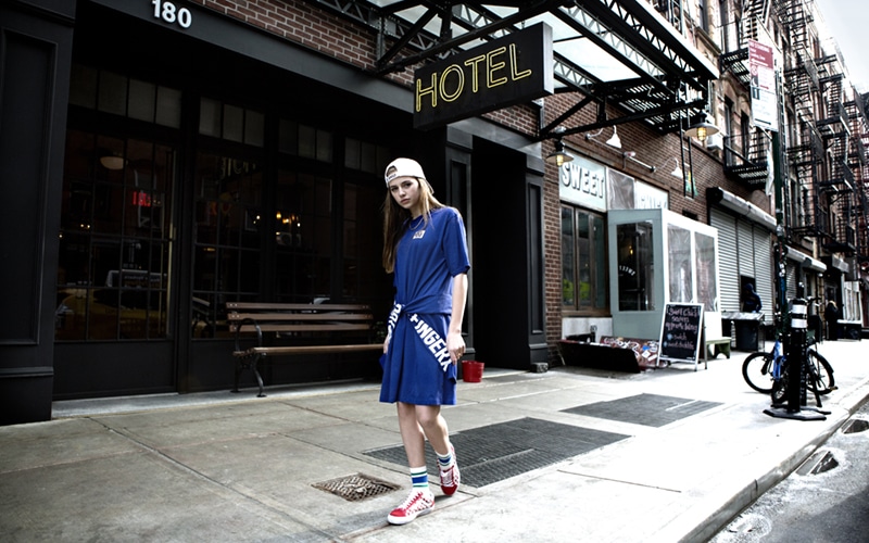
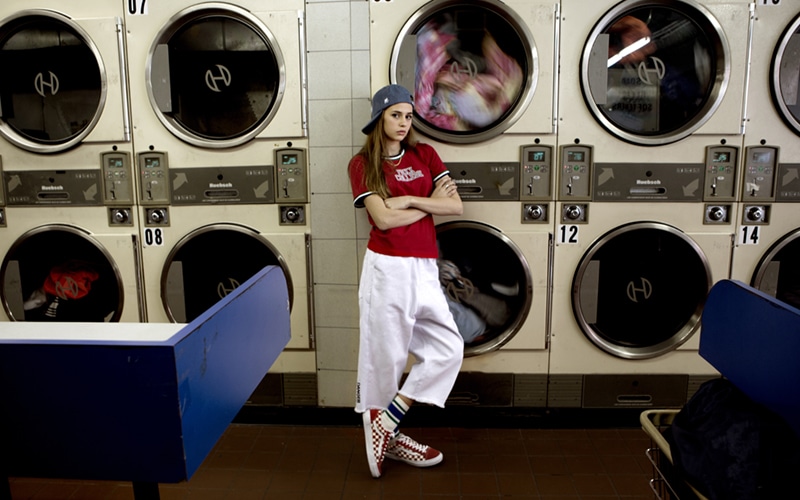
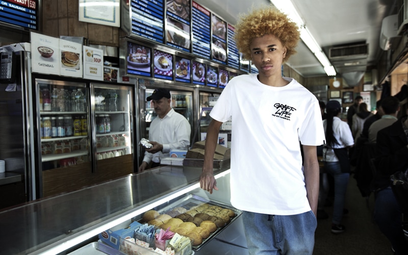
Street Graffiti
As the name suggests, ‘Street Graffiti’ draws inspiration from street art but with a fresh and clean twist to offer a sneak peek at another side of the story. Blue is the theme tone of the collection, with a mix of different shades of blue on short-sleeve tees and shorts. Denim makes a rare entrance with white ink wash details unfurling on a rich array of silhouettes to suggest a new chapter of the collection.
Back to the future
The 80s Hollywood blockbuster ‘Back to the Future’ is back and its powerful take on fashion invades fingercroxx too. Instead of the predictable elements taken from film characters and posters, the designer draws inspiration from the concept of ‘Future’ and creates a sporty collection from futuristic materials such as 3M reflective fabric and PVC badge, completing a dynamic look from the future.
Summer Vacation
The design team revisits the beachside carnival and its vibrant atmosphere with the ‘Summer Vacation’ collection laced with shark warning sign, beachside post, surfing shaka sign and camo print. The seasonal colour story combines the soft pink and denim blue of the magic hour sky to encapsulate the cosy summertime sensation of the ‘Summer Vacation’.
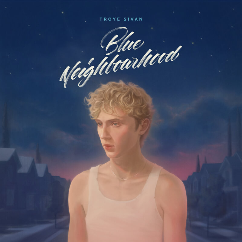
Troye Sivan celebrates 10th Anniversary of his planitun debut album with BLUE NEIGHBOURHOOD – Ten years on, set for release on February 13, 2026. Limited Edition features two additional tracks – “Swimming Pools” and “Strawberries & Cigarettes” – plus a reimagined cover art.
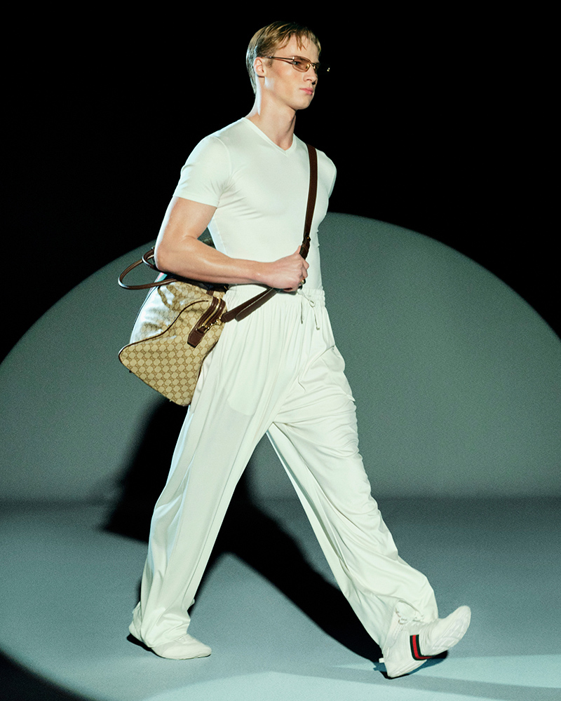
Titled “Generation Gucci”, the lookbook acts both as a nod to the archive and a projection of aesthetic continuity, layering historical codes to build a distinct vision for the house.
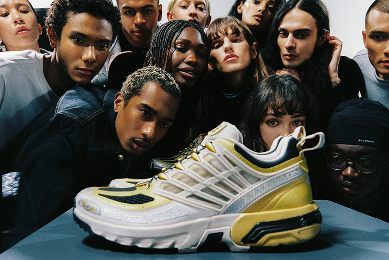
Salomon is marking the 20th anniversary of its ACS PRO trail sneaker with a special edition. The release honors the shoe’s past while focusing on its continued relevance.
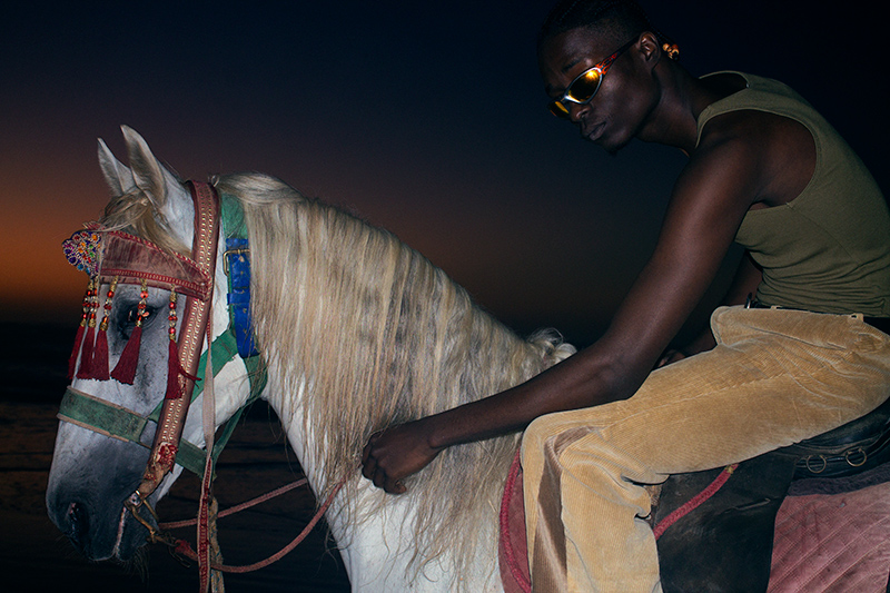
UNWRAPPED 2025 marks Grindr’s fifth annual global snapshot of queer culture, powered by insights from more than 15 million monthly users and 32,000 community votes.
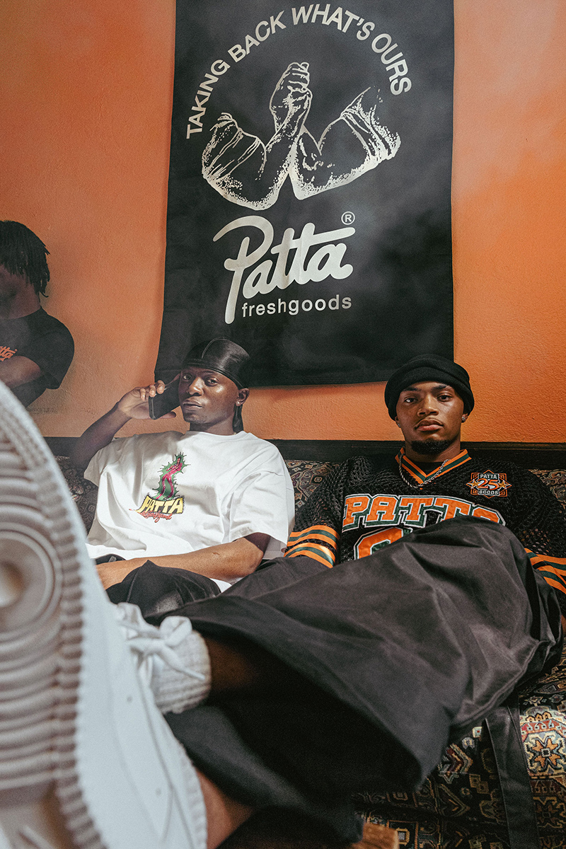
Patta and Joe Freshgoods have reunited for a new collaboration titled “PattaGoods.” This is their first capsule collection, uniting two independent, Black-owned brands.
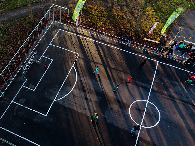
The Amsterdam-based brand Daily Paper has partnered with the Municipality of Amsterdam and adidas to celebrate the reopening of a local landmark: the street football court known as the “Adidasplein”.
The work of Slovak artist Andrej Dúbravský presents a world of bees, caterpillars, flowers, and naked boys who return the viewer’s gaze with confidence.
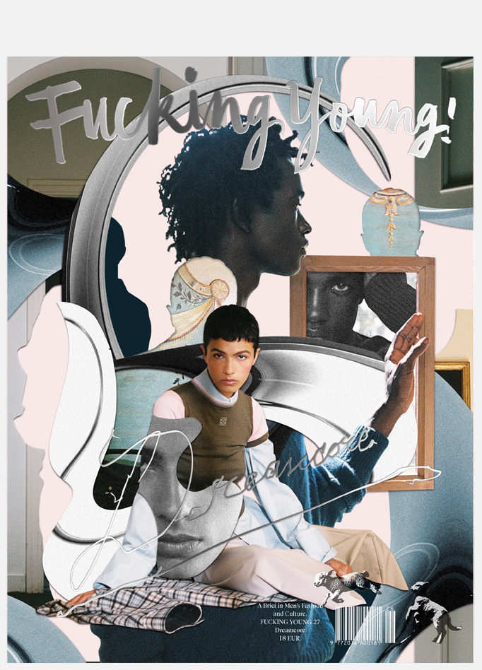
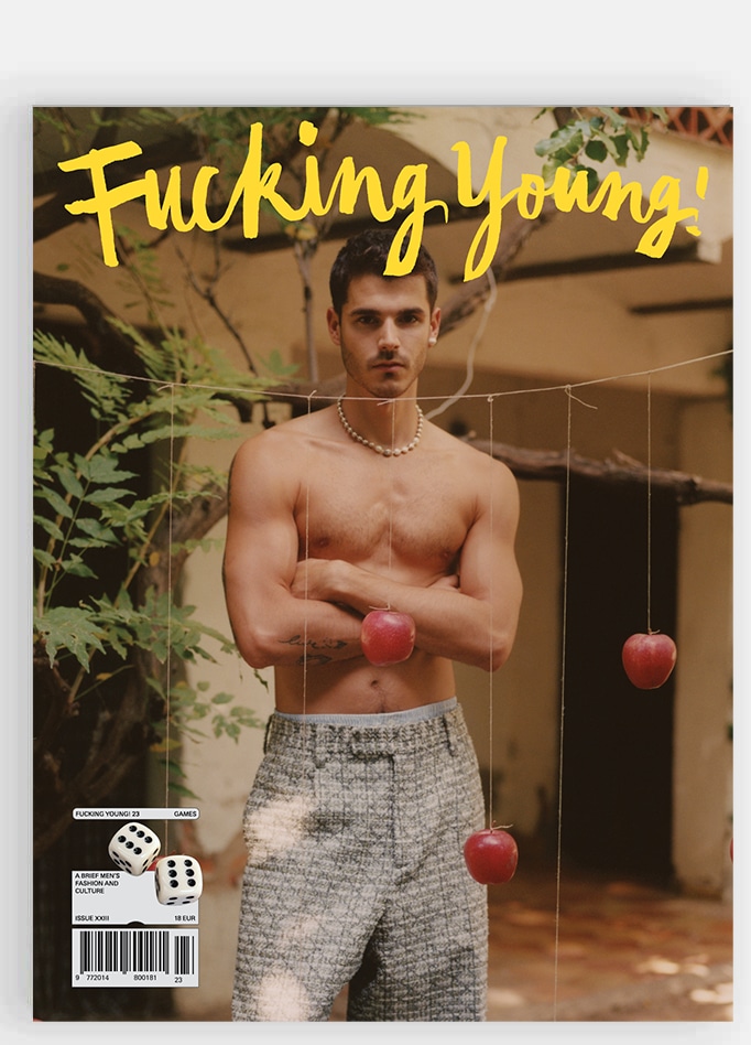
Turn the page. Breathe deep. Your pupils are already dilating. The high is coming.
Issue 26 brings together two electrifying covers that take the dopamine dive from Sadiq Desh captured by Cris Cerdeira to multidisciplinary visual artist and photographer Tomás Pintos’ cover story, Besos hasta agotar stock (Kisses Until Sold Out), developed from the live performance creating a space where glamour
meets exhaustion.