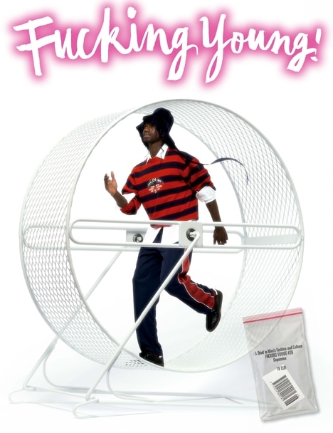
August 2, 2023, that was the day when Francesca Murri became the new Creative Director of Fiorucci – Italian brand founded by Elio Fiorucci in Milan in 1967 – and where she began to develop all her knowledge and skills acquired in past experiences working as a designer for renowned fashion houses such as Armani, Givenchy, or Gucci, among others.
From that day on, the company took a new direction, more oriented towards what is known nowadays as design and fashion, and as proof of this are the four collections that have been presented to date, in all of which the company’s characteristic vitality has predominated.
There is no doubt that Murri is elevating and positioning Fiorucci in the first category, because after being in the background for a while, it is being talked about again. All hard work seems to pay off in time.
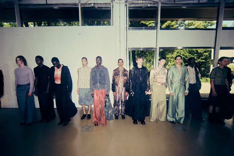
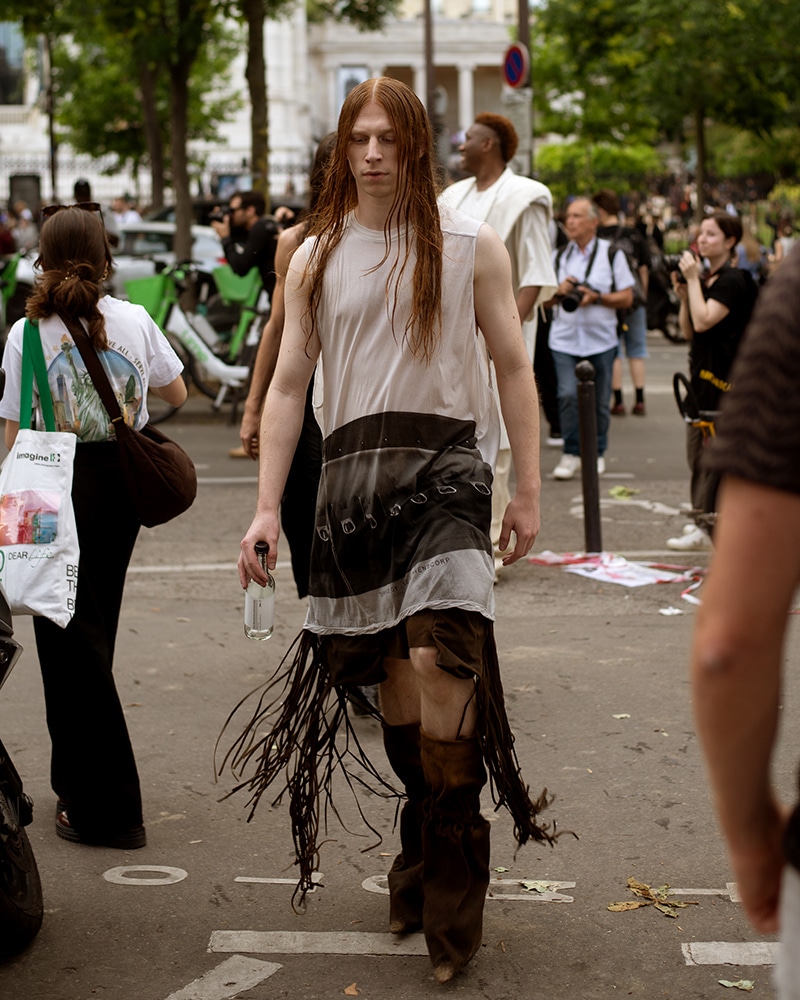
We spoke to Francesca at the end of the latest Fiorucci show held during Milan Fashion Week. Read on to find out everything she told us about her latest work, “Beatittudo”.
Francesca, congratulations on the collection you just presented. How are you feeling?
Thank you very much! I feel great. It’s finally out. I really wanted everyone to see it and enjoy it as much as I and the team enjoyed doing it.
“Beatittudo” is the name you used to title the proposal. What does this word mean to you? And, what is the main idea behind it?
Right. Beatittudo is a word that comes from the Latin language and for me it means happiness in its purest state. That happiness is what I want to transmit in this proposal.
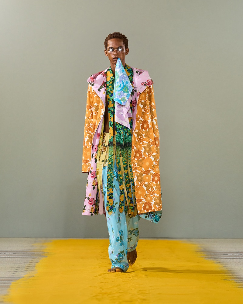
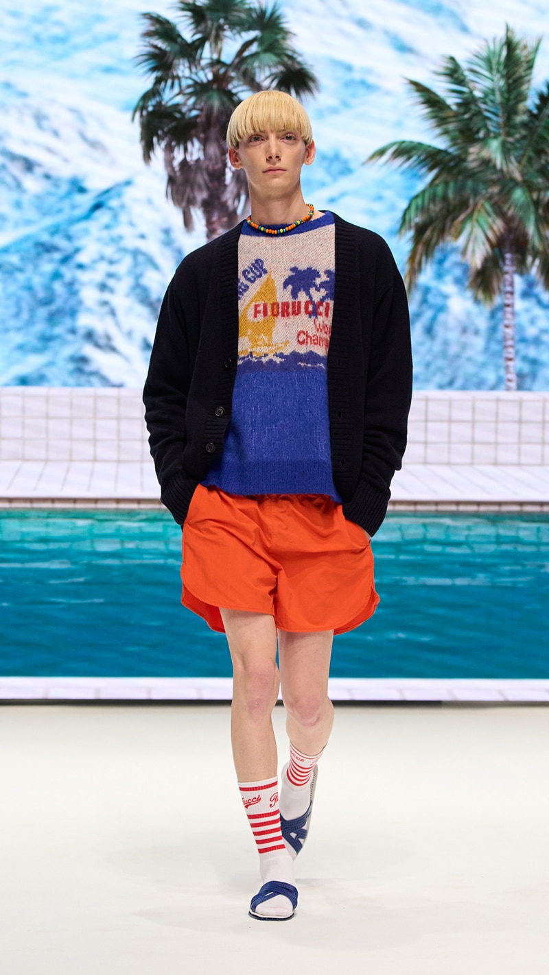
The main idea of it is to celebrate the great archive that Fiorucci has and the positivity that it gives off. We need a positive message and to remind people, whether they are young or mature, what it means to feel happy, not only with material things, but also with the experiences that life offers you, like being on holiday with the people we love.
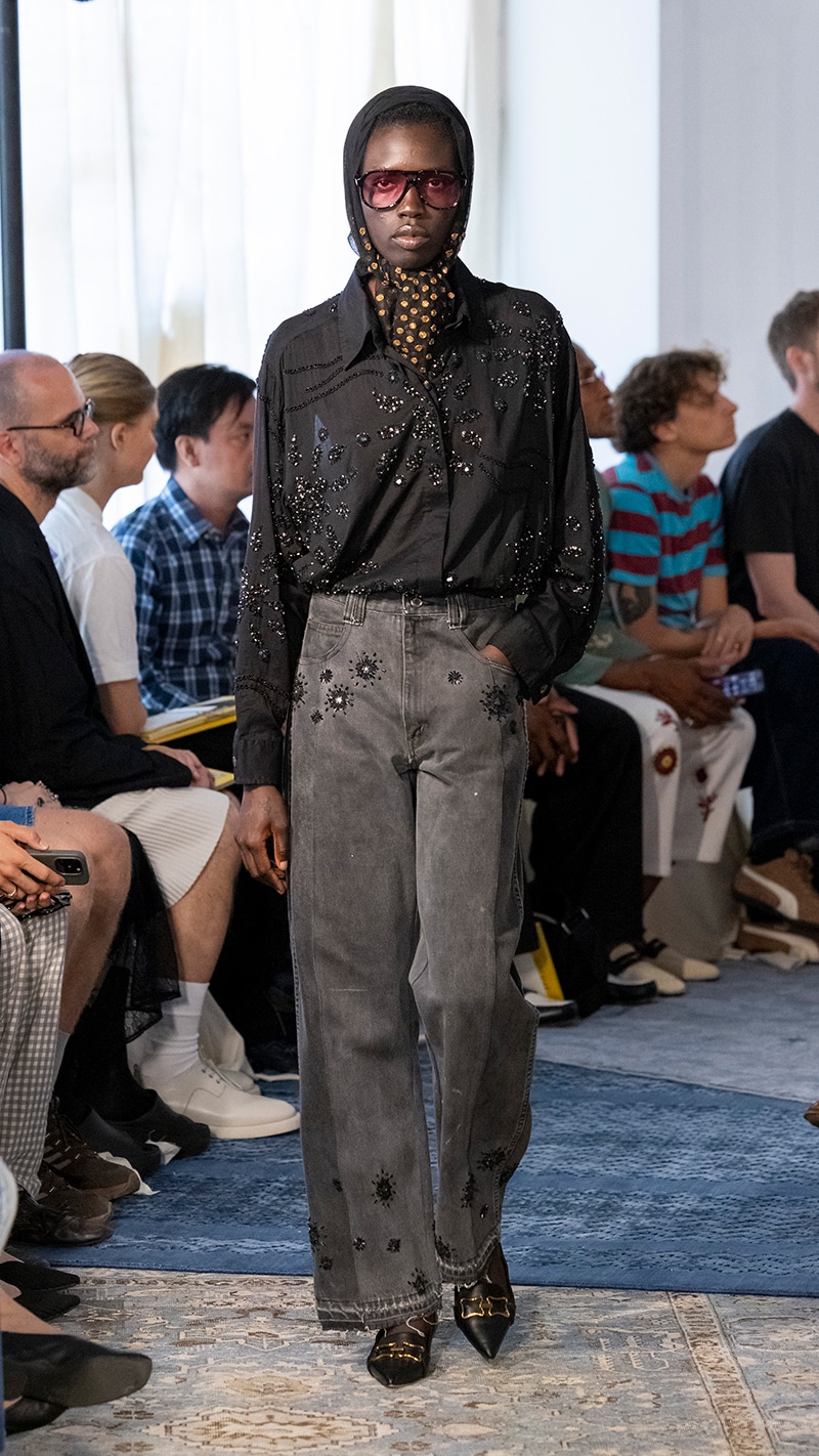
That happiness and positivism you talk about can be noticed perfectly in your new work, either by the graphics or by the chosen color palette. Why did you decide to choose this one instead of a darker one?
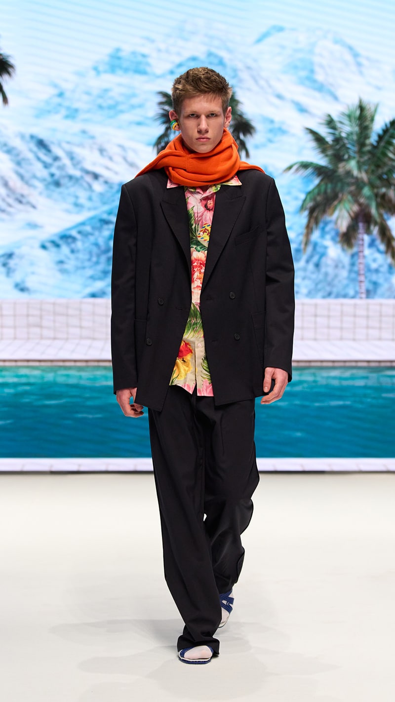
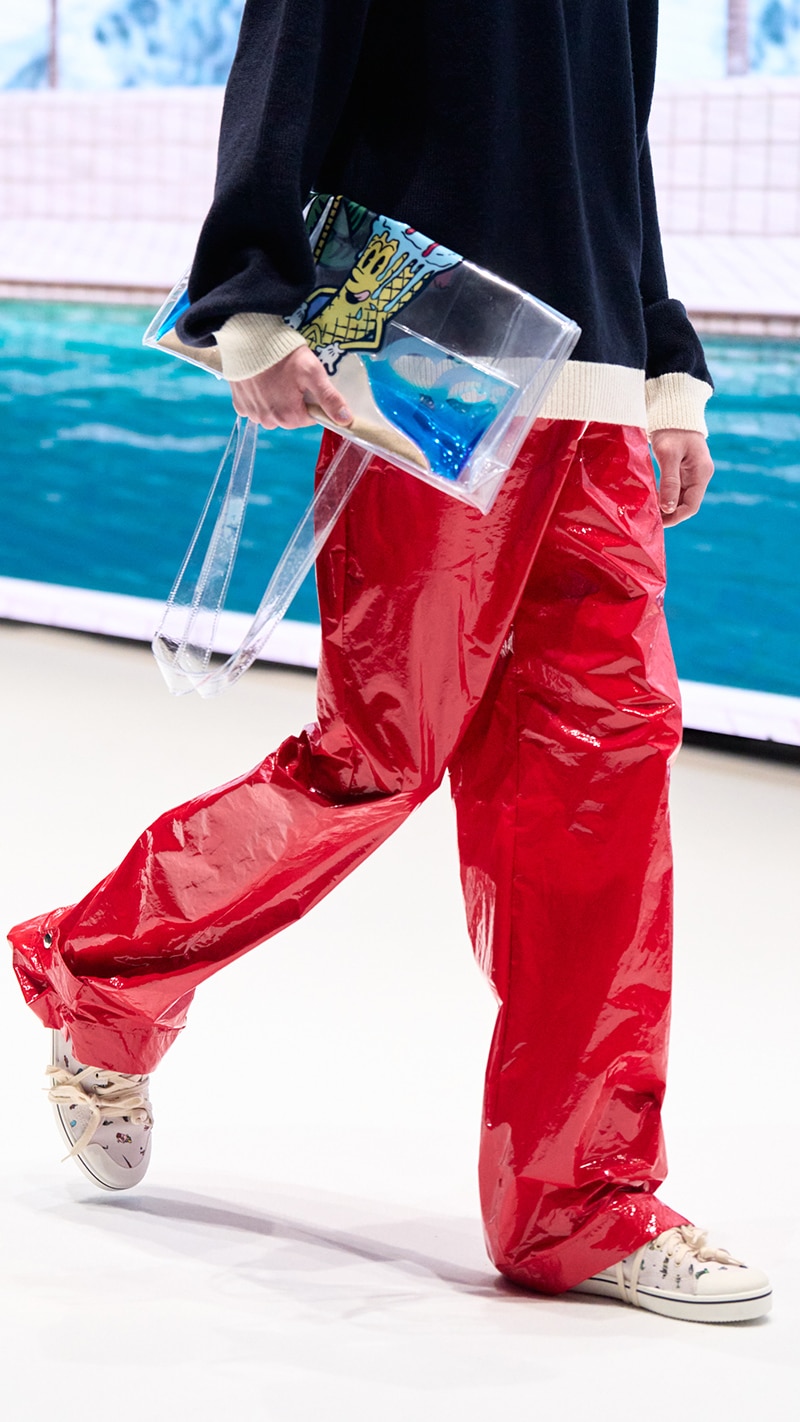
I chose this palette because I think the fashion industry needs a shot of energy and fun at the moment. Everything is grey and I feel it’s time to offer something different from the rest. And also, because it connects perfectly with Fiorucci’s DNA. In its archive, you can find many types of graphics, even for winter. I have included the one in the shape of an ice cream, which in the past was one of the first to be used and served as an element to reinforce this concept.
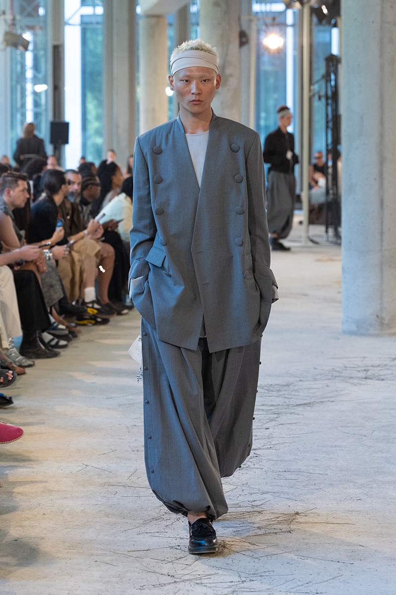
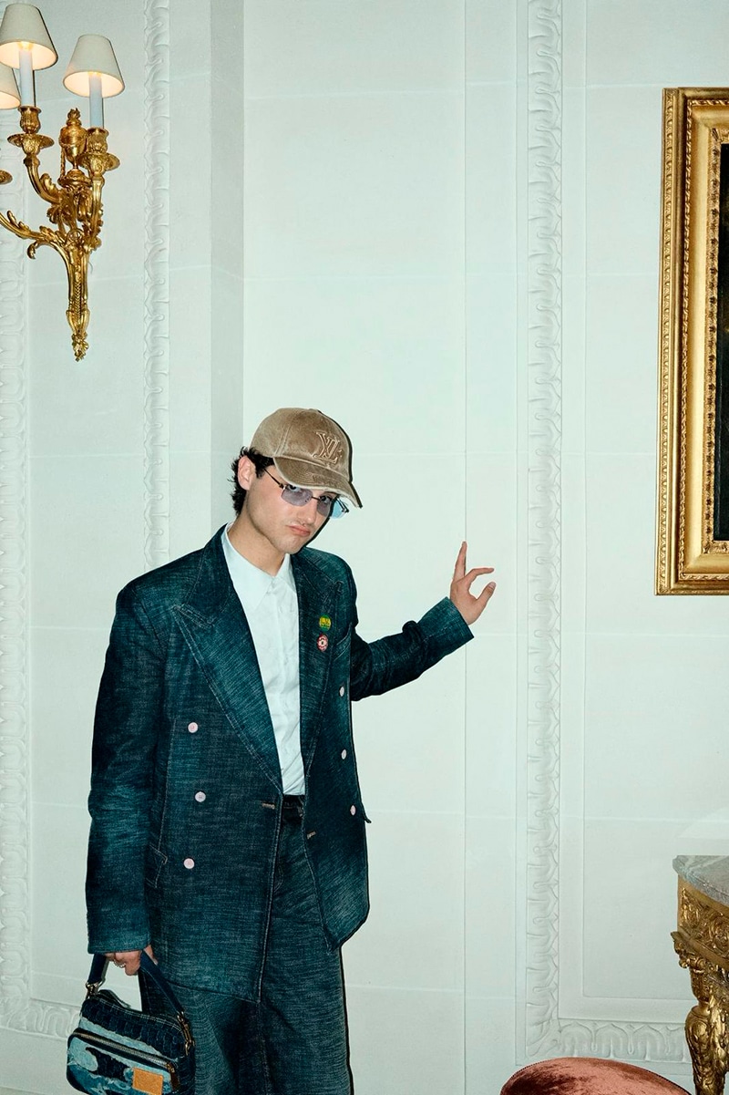
It makes sense. Talking about clothes now, what has been most seen in the line has been tailoring. How important is this field for you?
Tailoring is very important to me. It’s a field I’ve been very close to in the past. I learned a lot working in it and I wanted to tell my experience through this kind of pieces, but in a more brand-related way.
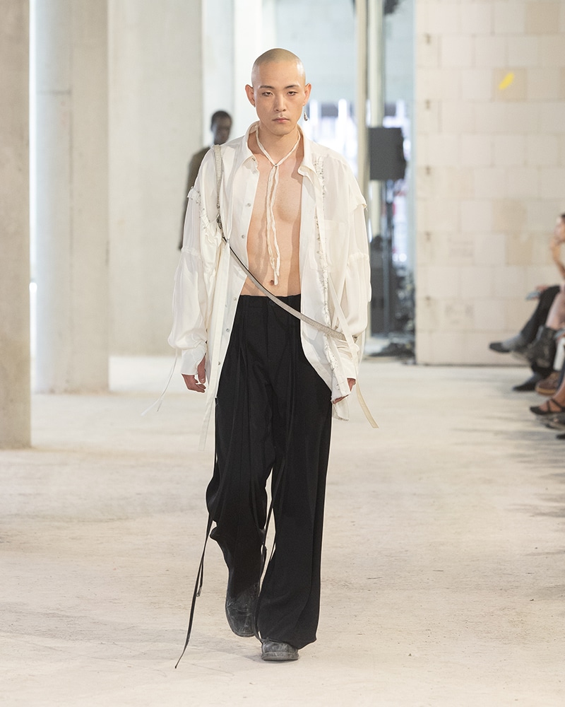
Continuing with the pieces, some of them have been made in futuristic fabrics. What can you tell us about that?
In the past that I mentioned, I also spent a lot of time using shiny fabrics, so in some way I feel connected to that. That’s the reason why I’ve been using those kinds of fabrics, recycled or similar.
Surely next Fall/Winter we’ll see many men wearing your designs. Stylistically, you know what they look like, but in terms of personality, how would you define them?
I would say that Fiorucci guys are very self-confident, ironic, and of course very creative.
Agreed! Still with those seasons, where would you go on holiday if you had to take a break?
To Portofino. It’s a perfect holiday destination for both Spring/Summer and Fall/Winter. For me, it’s a very inspiring place; you just have to look at the collection.
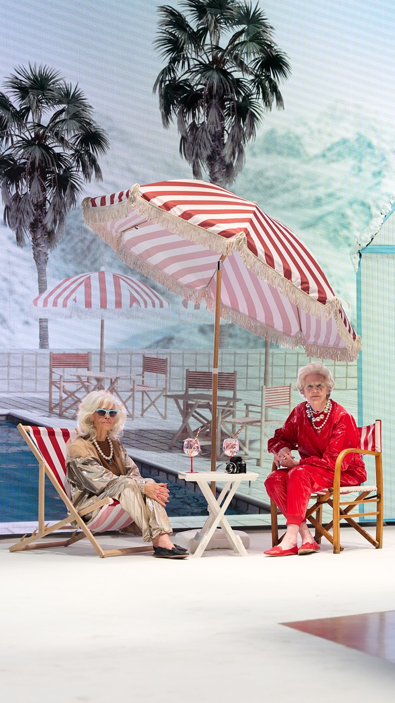
The collection, and also the set and the visuals, because both are very reminiscent of Portofino. What is the connection between all of them?
Yes, indeed. When we started talking about the show and everything related to it, my desire was to be able to recreate a kind of surreal world in which to connect everything mentioned. We were researching for weeks to find things that were positive and in a way funny and ironic. We finally succeeded. And as a cherry on top of that, we decided to involve Amanda Lear, who for me is an icon and at the same time the perfect symbol to represent the Fiorucci of today, connecting maturity with youth.
You just mentioned youth. In relation to it, what is your earliest memory of Fiorucci?
My earliest memory is the hinges because Fiorucci was not just an angel, but much more, and that’s what I want to tell. Elio Fiorucci did incredible things.
Finally, you’ve been working as Creative Director of the brand for about two years now. What’s your assessment of this period?
Honestly, it’s been a great adventure, because although from the outside it looks like a very big company, in reality, it’s a start-up, and I come from working in brands with a bigger infrastructure. It’s different but I’m very happy to be here. Everything is very well organized and the energy is very good.