Plùs Que Ma Vìe, for upcoming Spring Summer 2016 season, departs from its native land, Venice. It creates a journey, a large poster that takes theme in its systematic evolution. Venice, by name and fact: Venice conceived as the centerpiece of an artistic improvisation which flows into the turgid world of fashion. Indeed, improvisation.
The collection studies and takes form from a promiscuous, retelling, aseptic vacuum of what is Venice for Andrea Lazzari; a city with many dimensions, with a story made by art, architecture, smells, tastes, colors, all taken and reinterpreted as an Impressionist painting. The aim of this study about Venice is the need to distort schemes of a city like Venice, always the emblem of a defined and unique perspective.
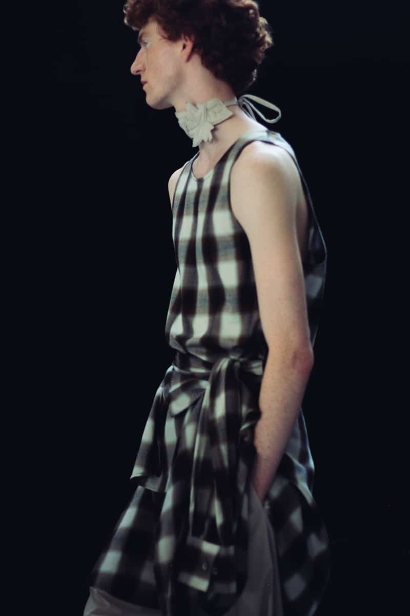
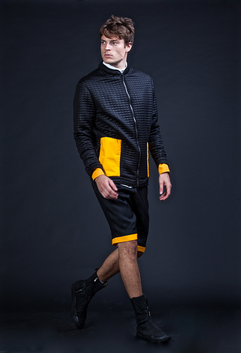
Fashion is always closer to every action and reaction, to every abstract and concrete object, so, Plùs Que Ma Vìe chose to analyze it, to undress it, to go over to live its subconscious. The end result is a complex and harmonic collection, which confuses different targets and ways of thinking, compares dissonant colorimetries, antithetic forms and volumes, all closed and tied by the unique spirit of the brand: the formal order. Venice has been studied from the point of view of architecture and urban planning, from an analysis of buildings and squares grilles and floorings. The result is a contrast of regular and irregular geometries and textures, a puzzle of shapes and off series colors, yet another surplus of emotions and hypnotic charges that only fashion can convey.
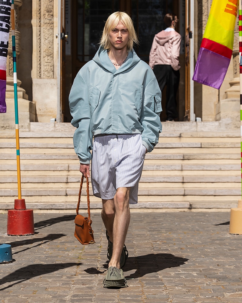
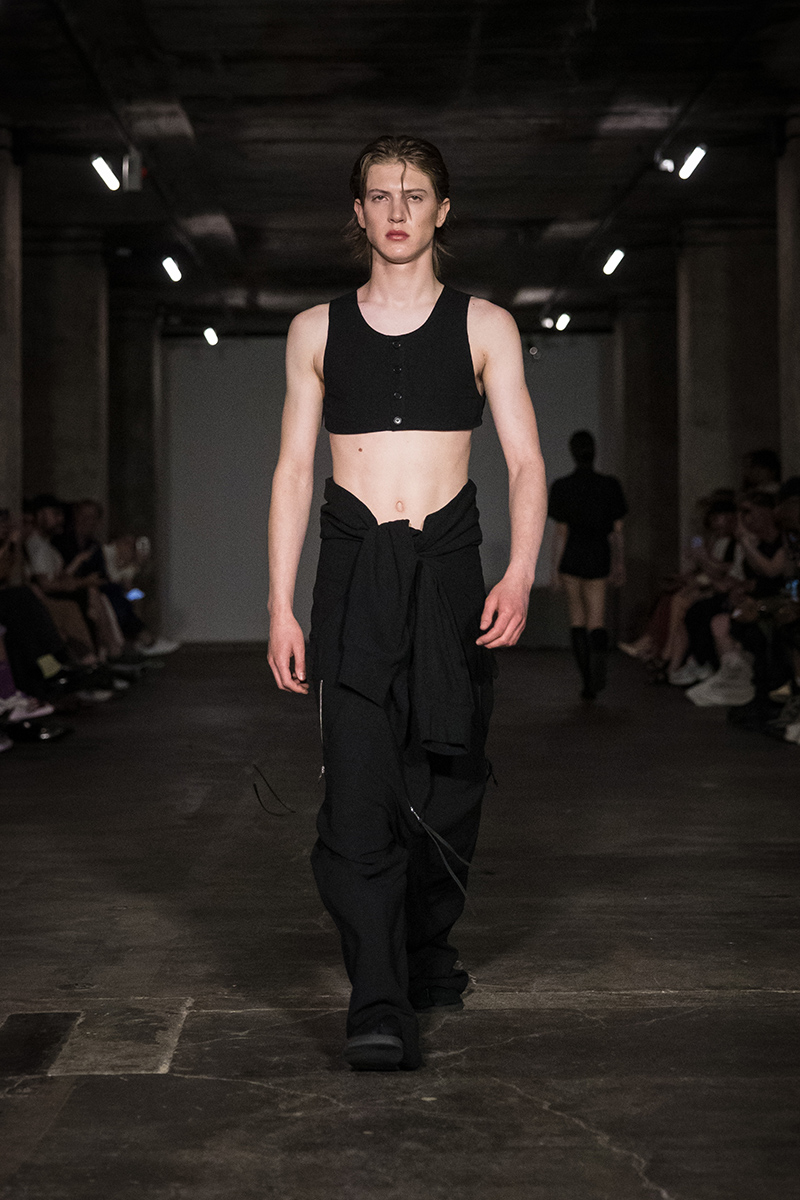
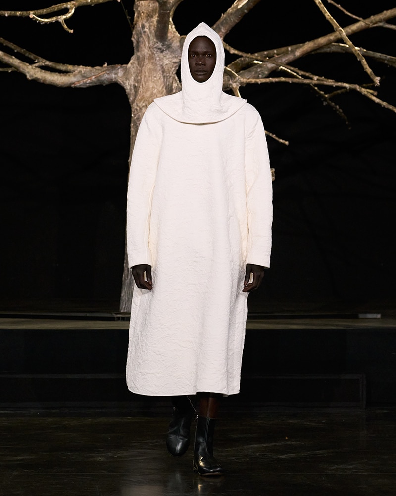
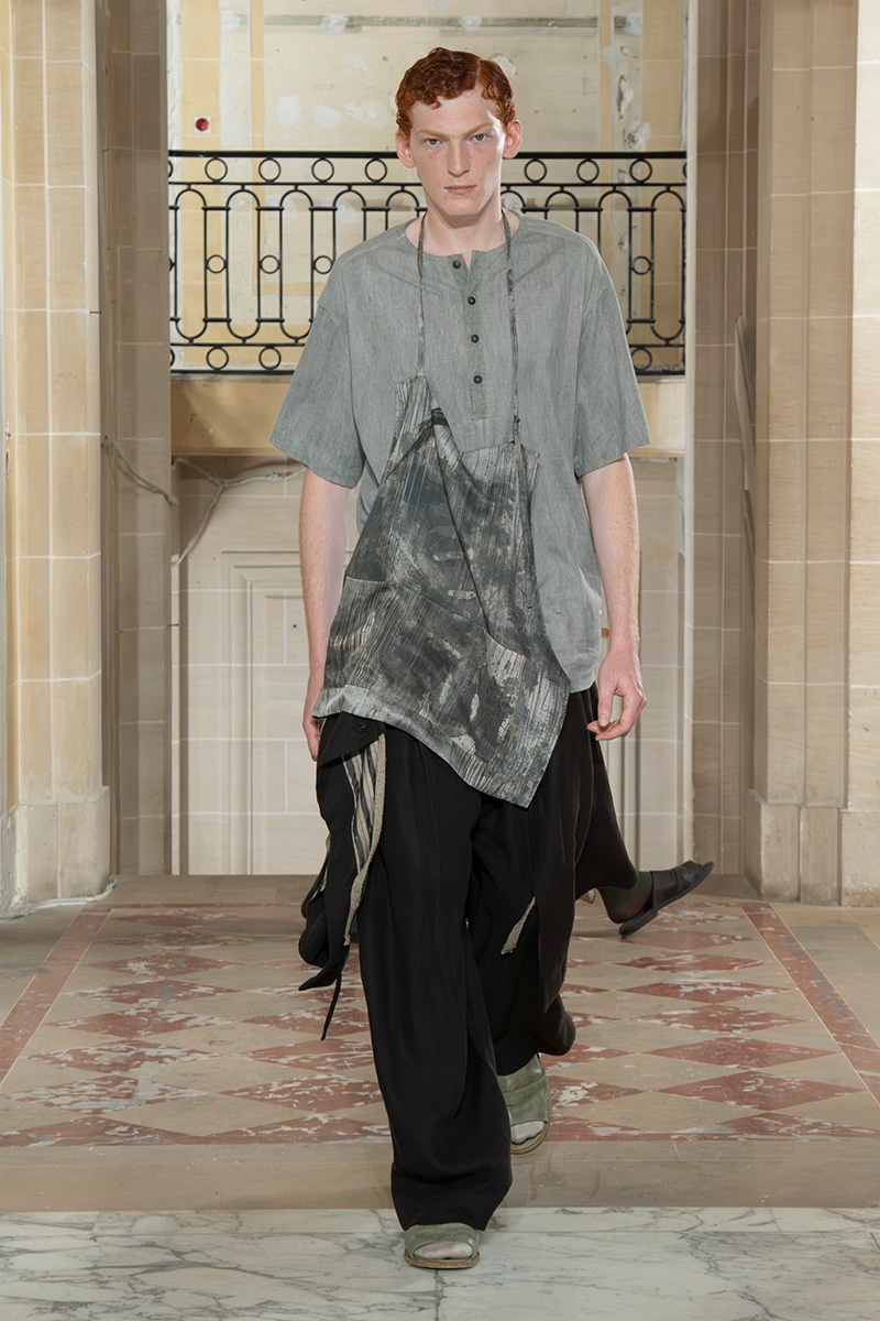
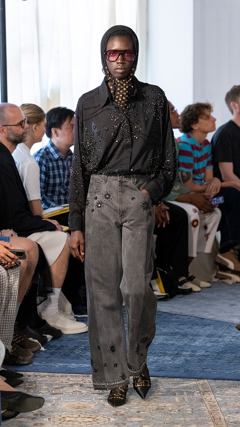
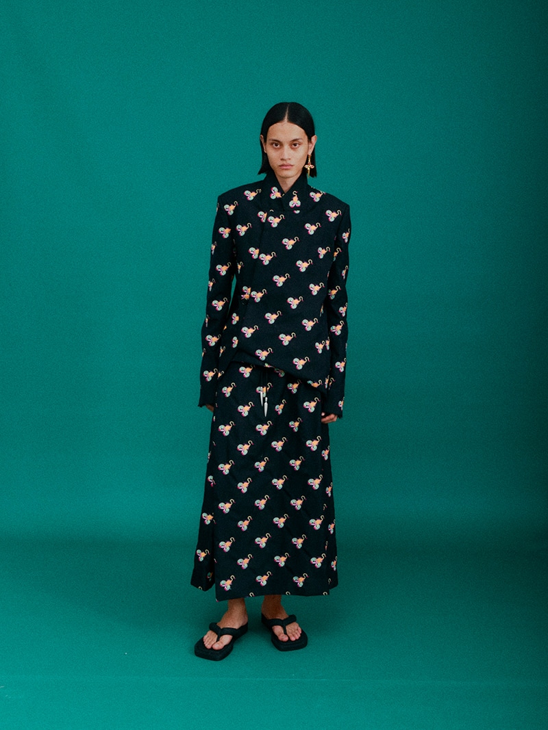
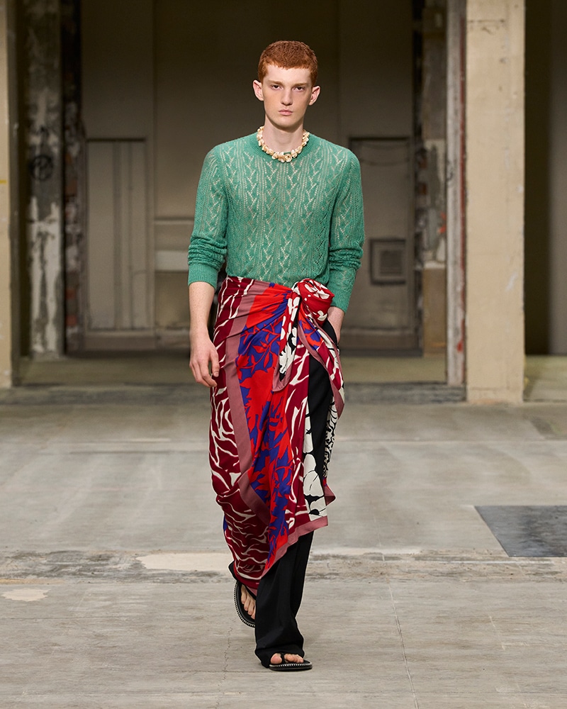
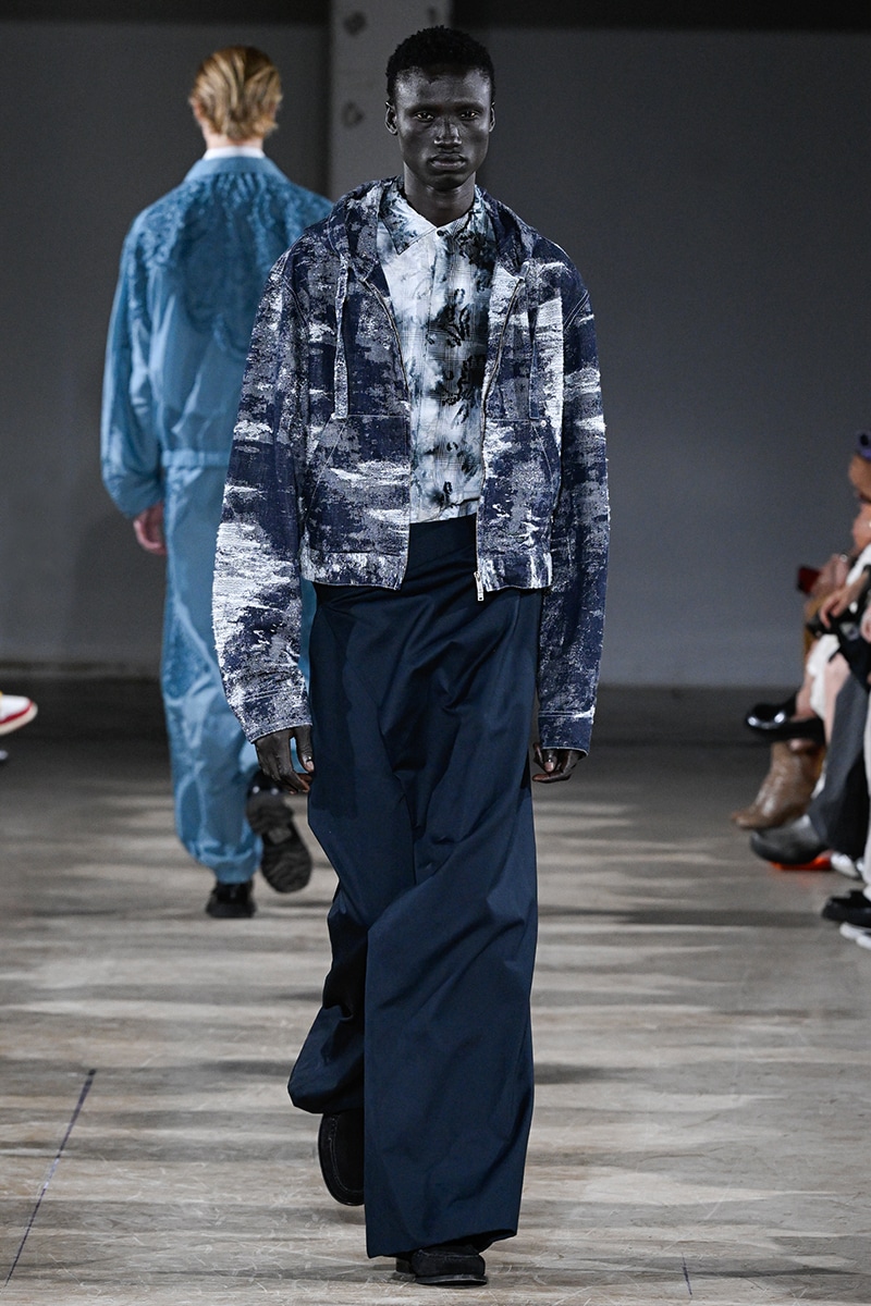
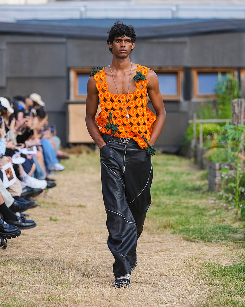
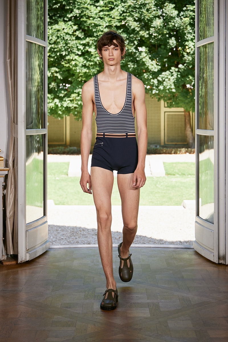
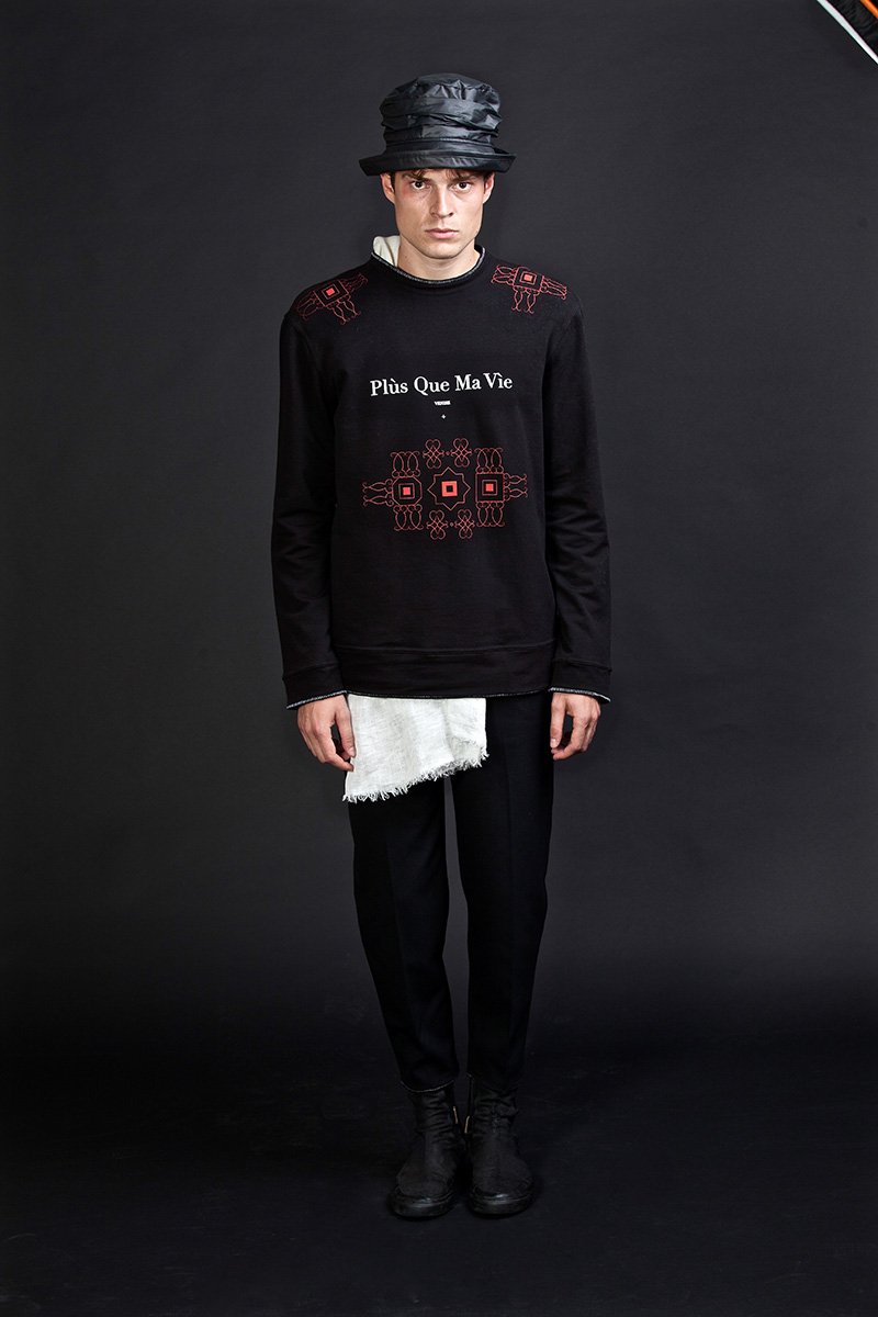
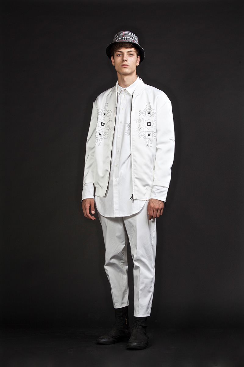
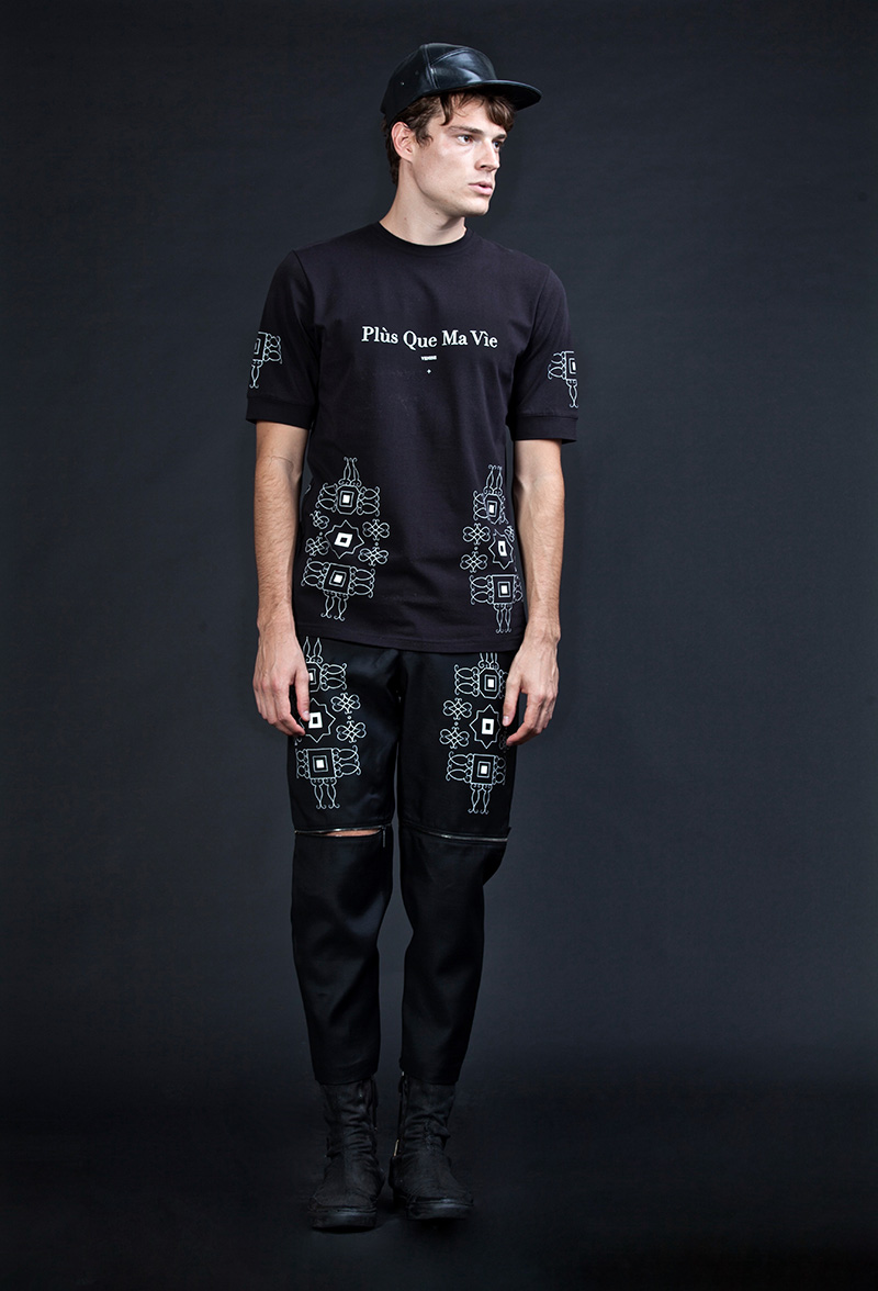
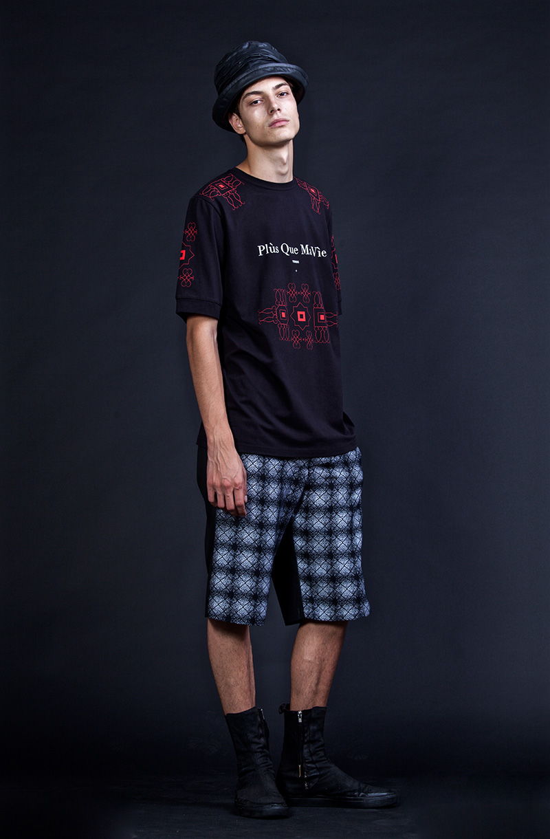
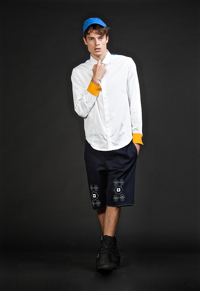
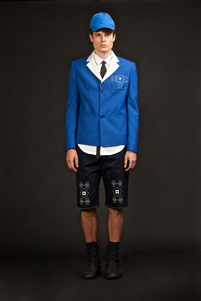
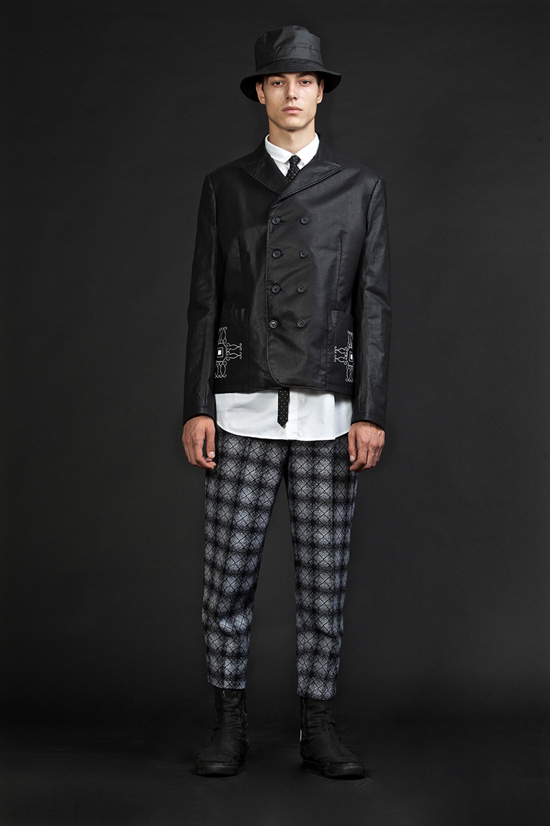
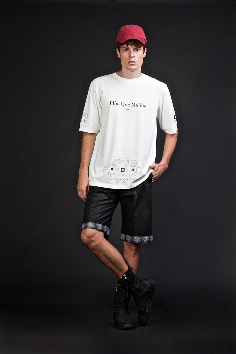
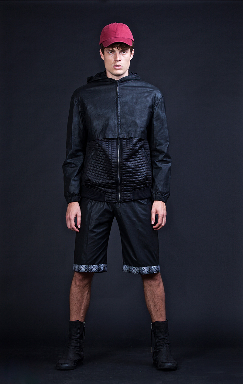
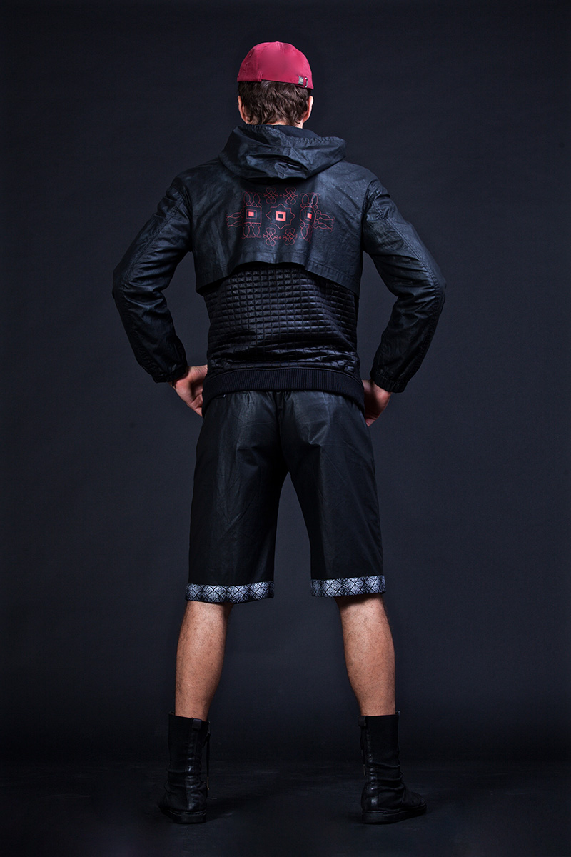
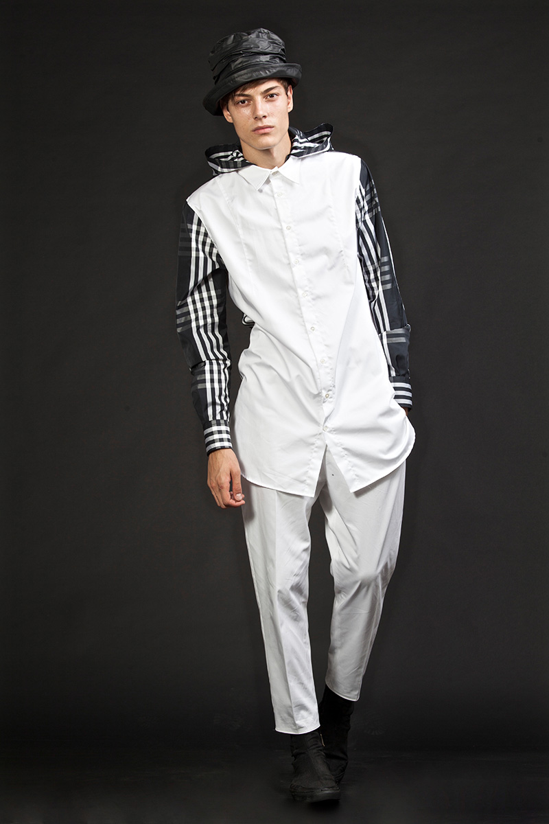
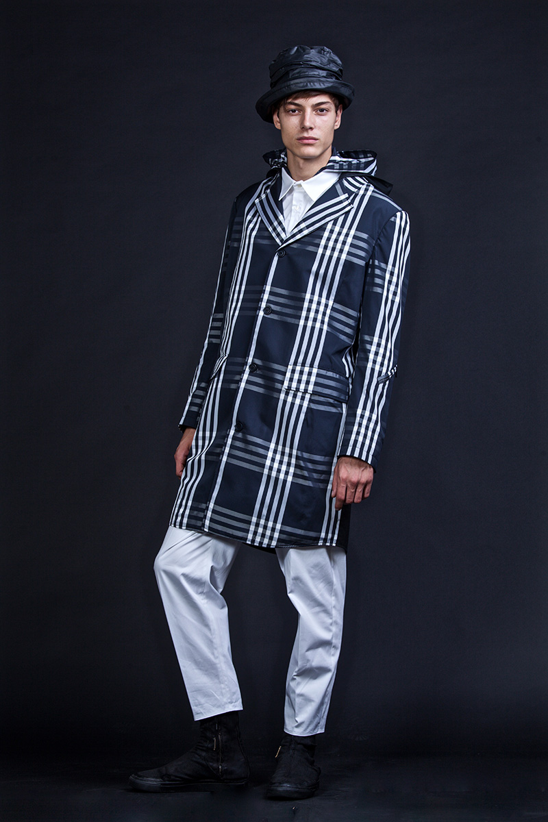
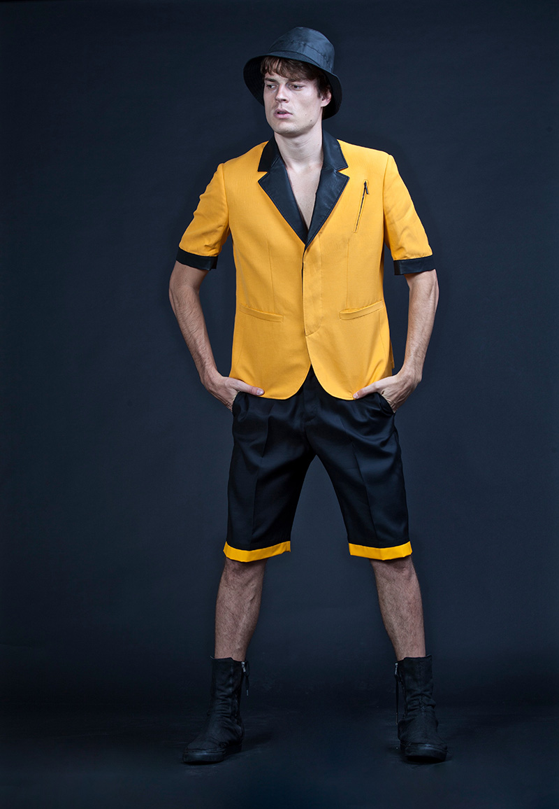
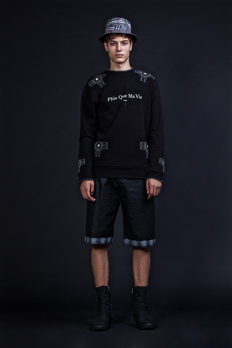
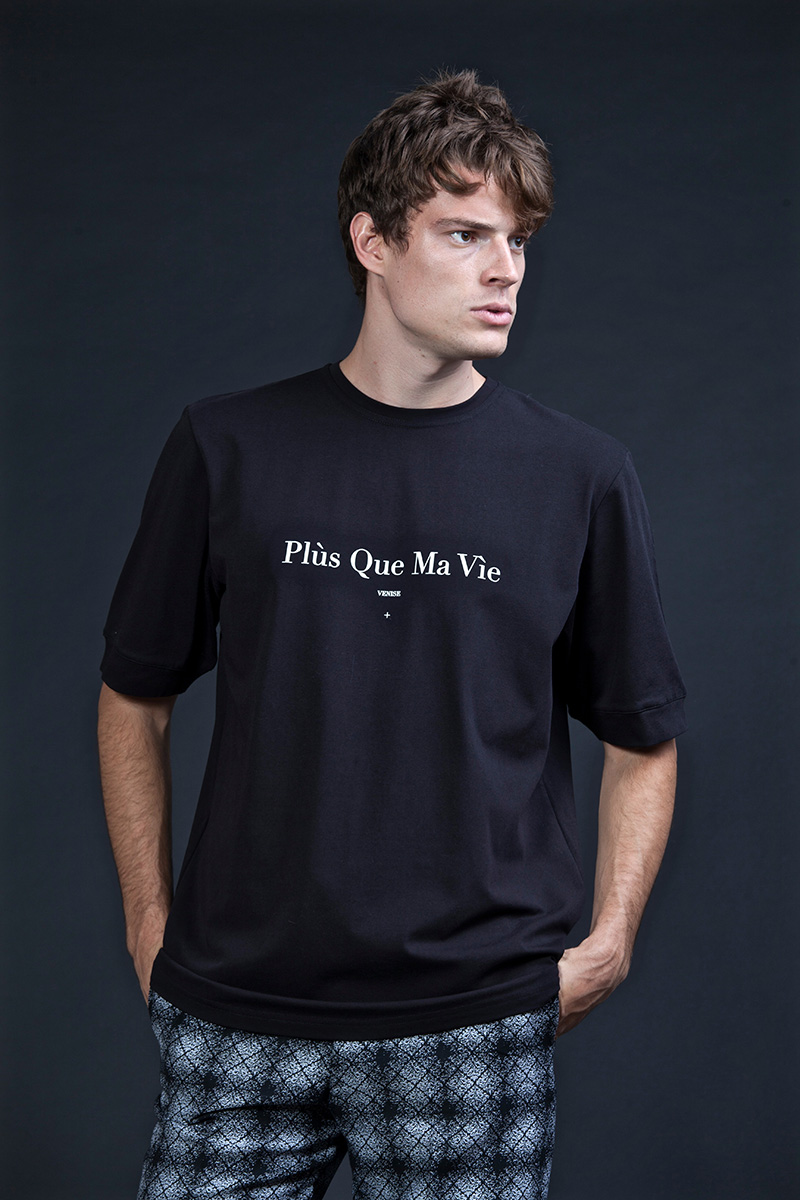
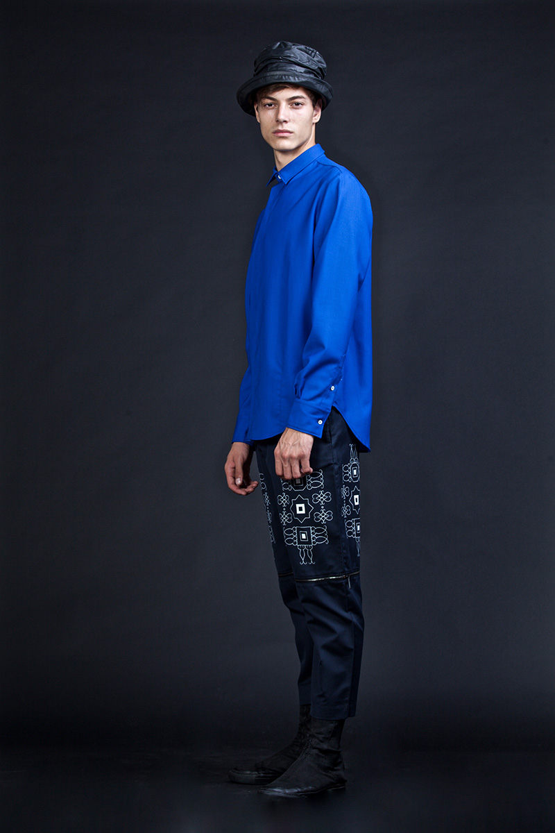
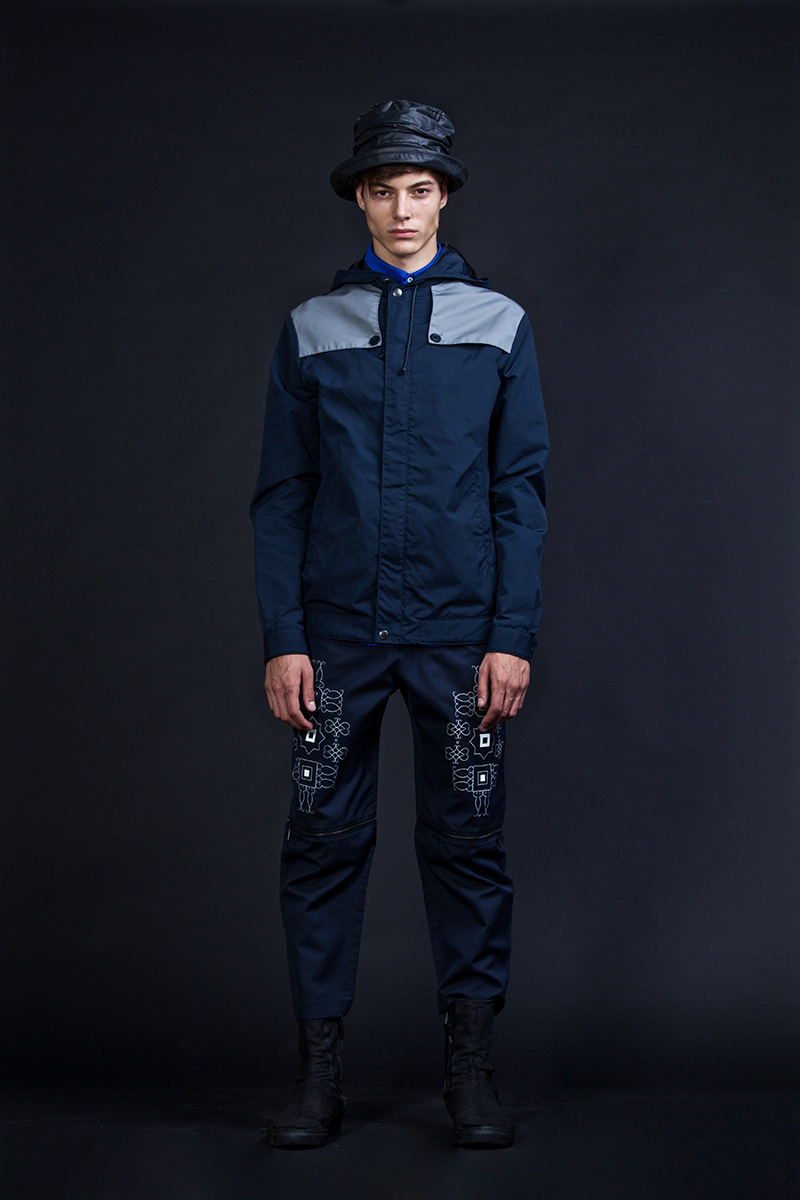
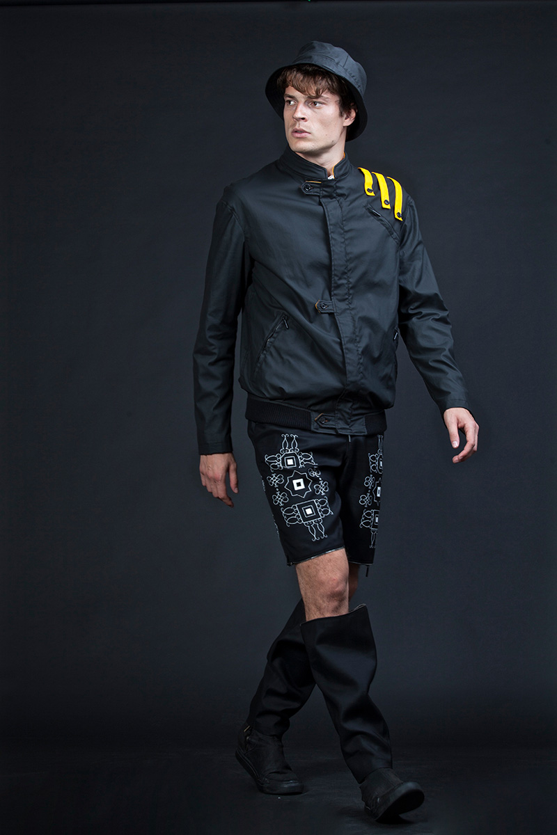
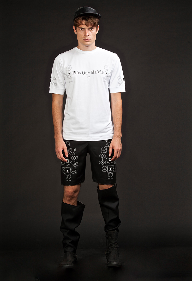
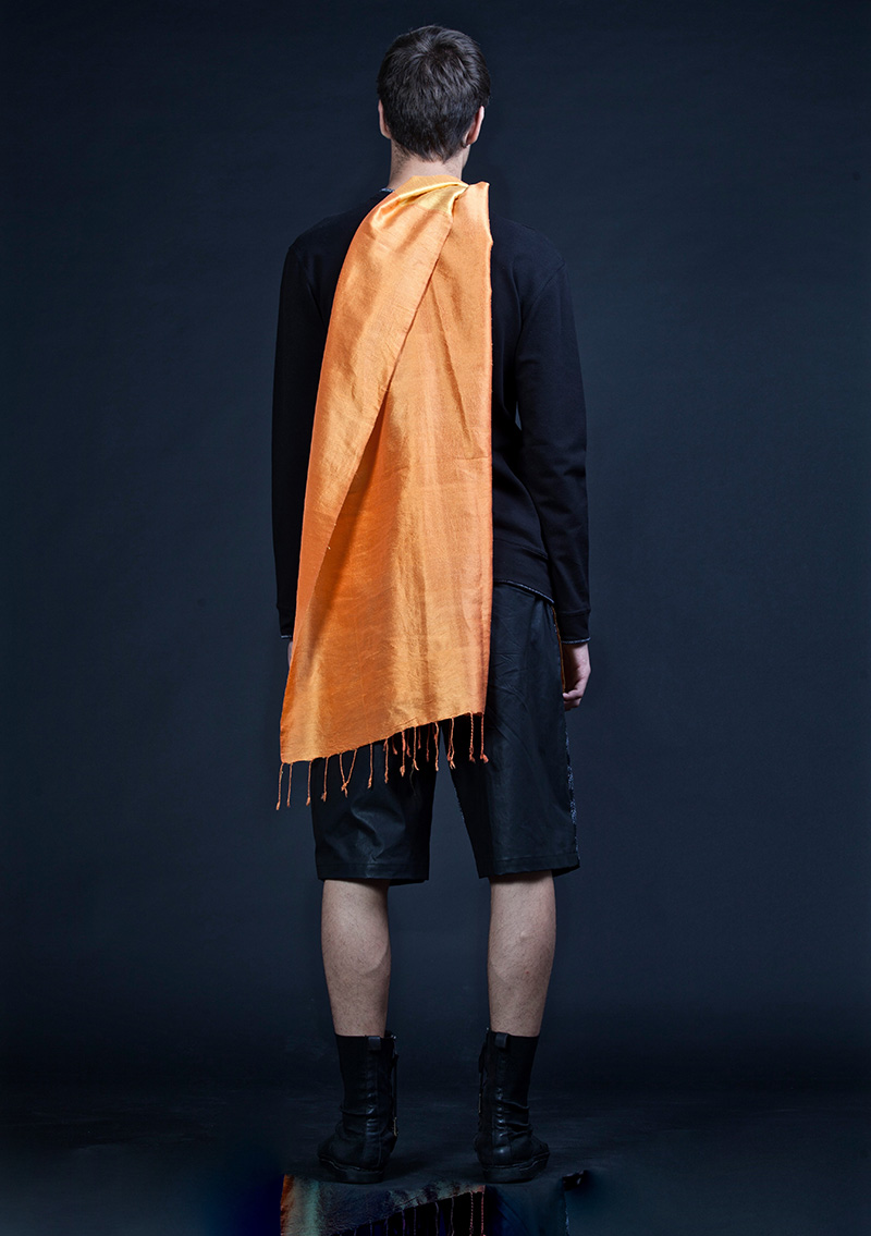
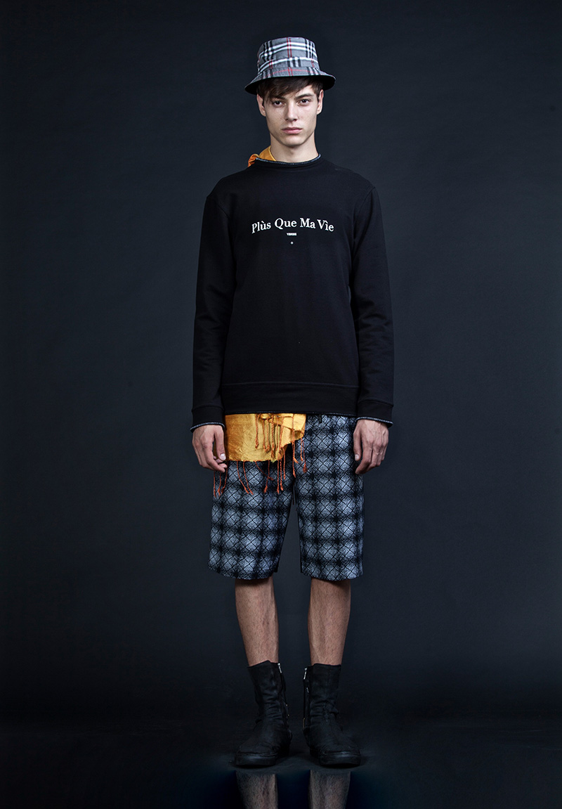
The silhouettes study and analyze different worlds: a post-punk, contextualised to our time, our life and our dimension; a streetwear chic, tendentious, between informal and post modern and a revisited formal one. The color palette analyzes all grayscales and whites, decomposed into colorimetries of blue, red and yellow. The end result is a vortex of contrasts between lights and shadow, light and dark. The textures enhance the sense of belonging to the pure geometry in Venice; they act as details of clothing, as an inspiration for the formal development of the collection.
There are relief prints, which propose a contemporary vision of the lion of St. mark, and prints mainly of belonging to Venice. The fabrics collection nourish and claim the brand identity: pure cottons merged into natural raw linen, technical fabrics, futuristic and waterproof blended with natural leathers and silk jersey. Plùs Que Ma Vìe decontextualizes a pre-existing world, deconstructs it, renews it, resettles it. P.q.m.v took Venice without flaunt, but subtly explaining it through the word dress. The interpretation is entirely subjective, and this is precisely the goal of the brand: enrich the viewer ‘s emotions, make it a parallel journey to life.